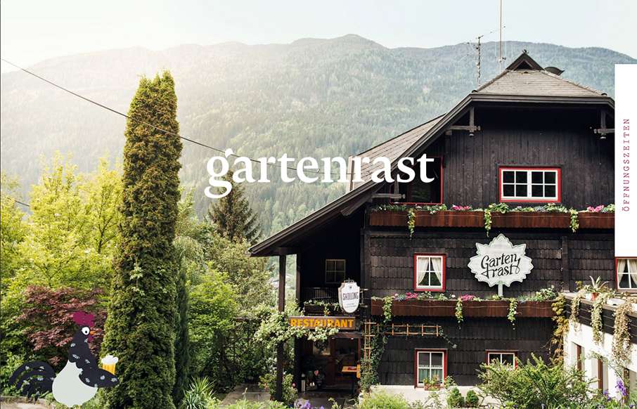
by Aaron Griswold | Oct 5, 2015 | Gallery, Travel
Clean, and a lot of gut white space. Love the hamburger / fork-knife-spoon menu – and roosters too.

by Gene Crawford | Aug 6, 2015 | Gallery
I really like the fixed elements on this website. The left nav and the header & footer area are cleverly done. It really feels like a unique layout, even though it’s not really in the long term scheme of things. Great work here. From the Designer: A minimal...
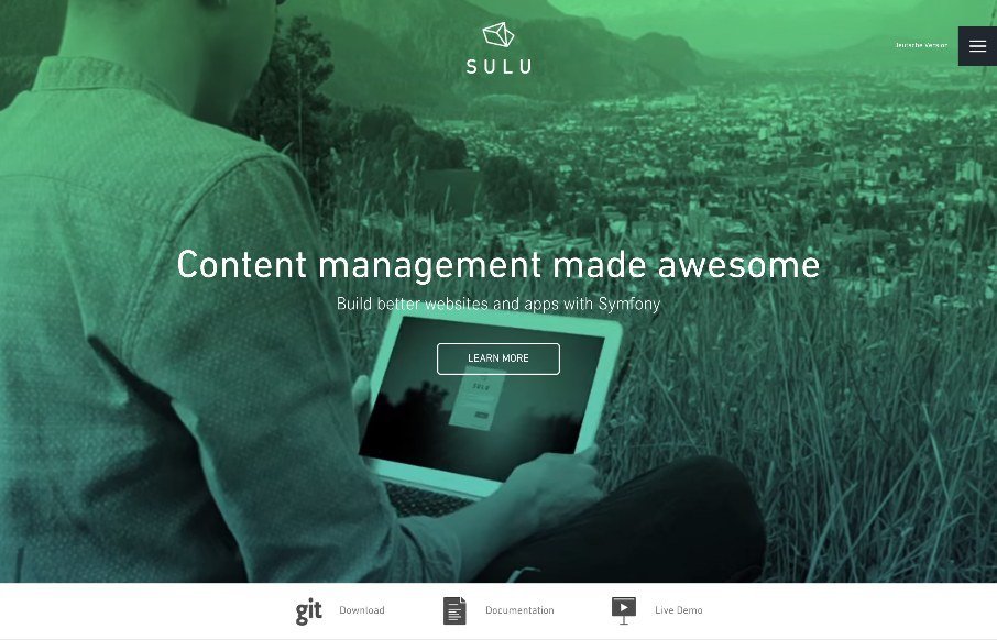
by Aaron Griswold | Jun 17, 2015 | Gallery
Good clean design on Sulu, a CMS built on Symfony. We almost listed it in Radar as a resource instead of the Gallery , but we liked the white space and the little animations that happen on-scroll. @sulu_io : Handcrafted in the Alps Privately funded by...
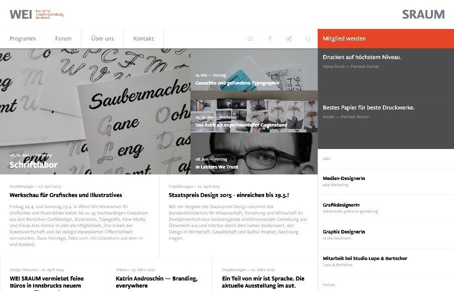
by Gene Crawford | Jun 4, 2015 | Conference, Gallery, Nonprofit
There is a lot going on here to get this website responsive visually. The grid is pretty core to its layout and it flows really well from screen to screen width. I also really dig how the header/nav stays fixed and moves up visually as you scroll down. From the...
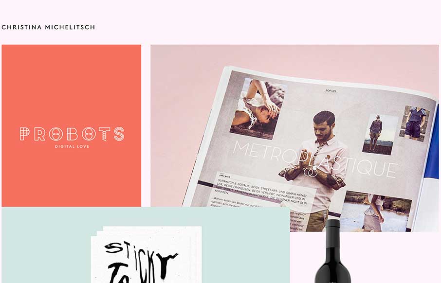
by Aaron Griswold | Oct 6, 2014 | Gallery, Portfolio
The beauty of this site is less in the home page, but more in the portfolio pages of Christina’s work. Each page has a different feel to go along with the different branding work she has done for her clients. Really like the work on Probots, and like the idea...