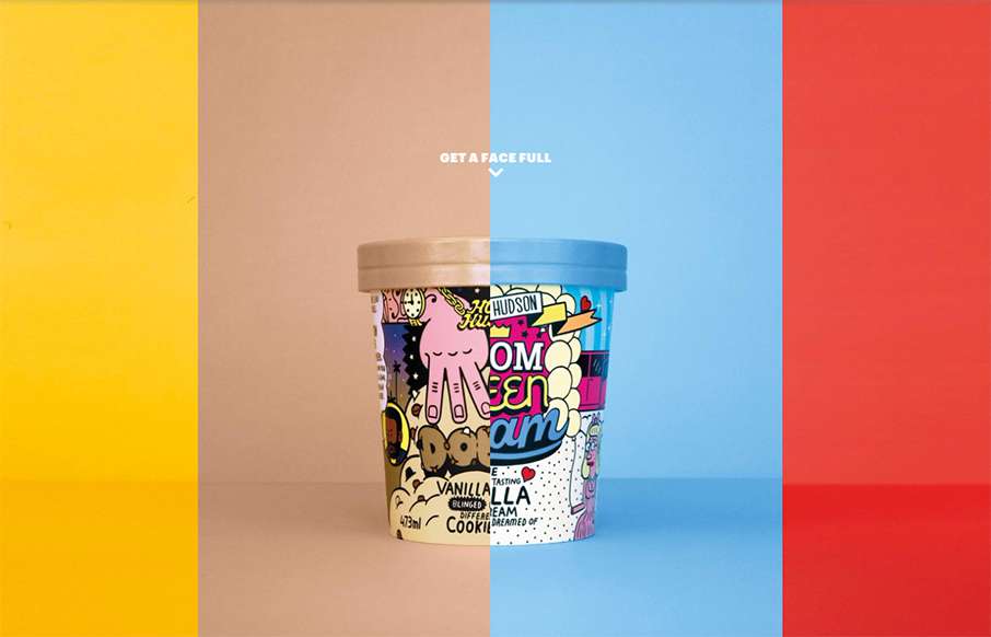
by Aaron Griswold | Sep 14, 2015 | Food and Beverage, Gallery
Never too early in the morning to think about ice cream… mmmm… ice cream… Homer Hudson’s site out of Oz is bright and different. Looks like one page with a few modals – compact, with all emphasis on the product. It’s a little bit of...
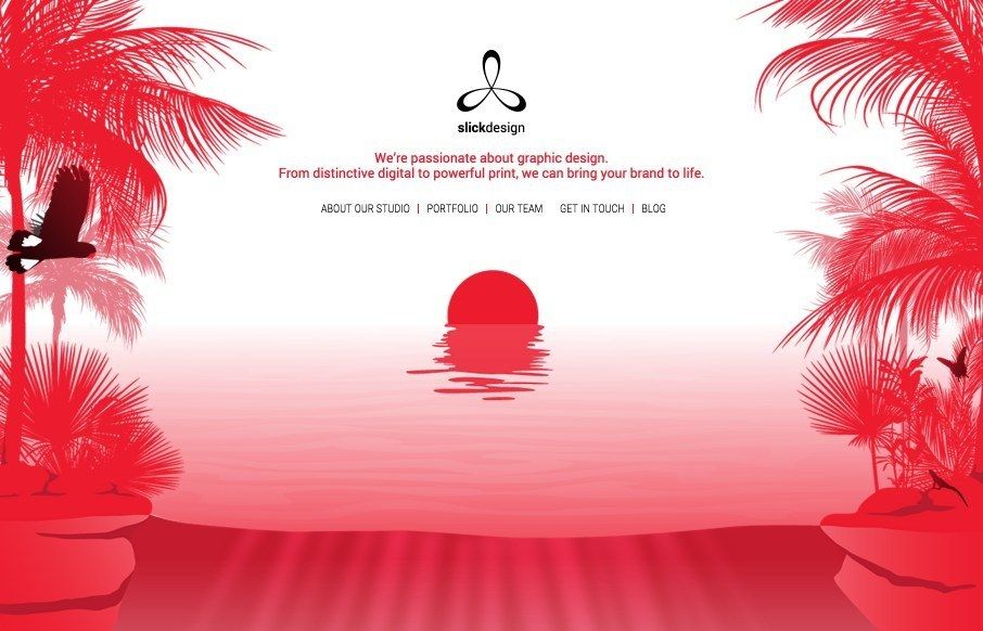
by Aaron Griswold | Jul 8, 2015 | Gallery
Love the opening and closing imagery for Slick Design out of Perth – the movement on the page is pretty cool too (would actually like to see more of it all the way through). From the Designer: This is a beautiful, sleek website that reflects the client’s...
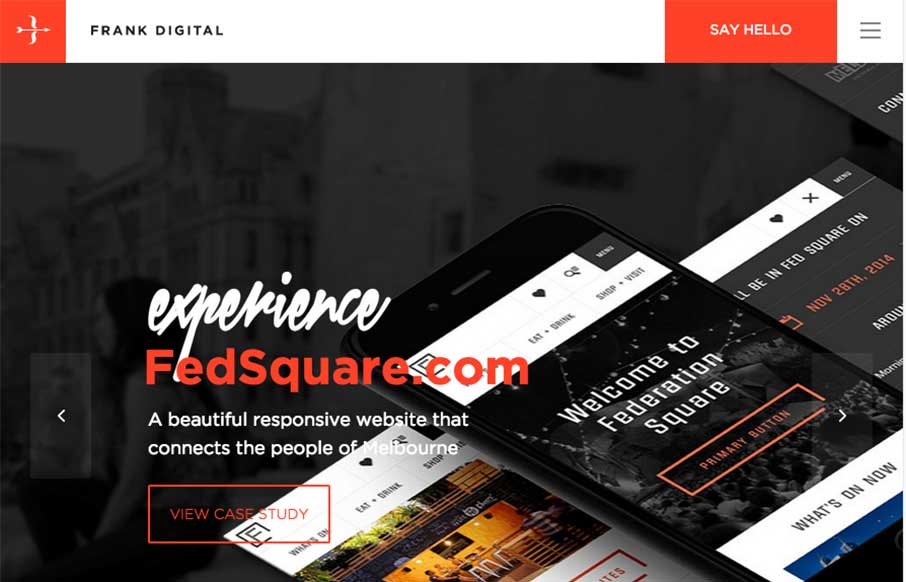
by Gene Crawford | May 26, 2015 | Gallery
Strong grid design and some some solid/strong color makes this website shine for Frank Digital. I especially like the asymmetrical layout of the portfolio section on the home page. Designer: Frank Digital Sydney & Melbourne From the Designer: We create websites...

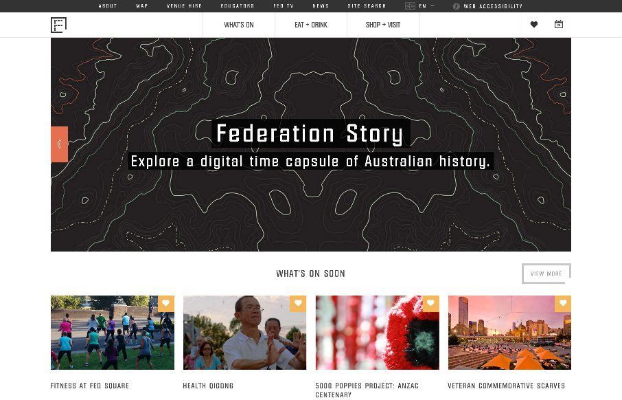
by Gene Crawford | May 12, 2015 | Gallery
Pretty tight agency website. It has all the hallmarks of a good agency site and is also very well done. The grid is strong and easy to scan and there’s enough little pieces to make it feel good as you scroll and interact with it. They also have some really...
by Gene Crawford | Apr 25, 2015 | Gallery, Nonprofit
I like the blocky-ness to this layout. Though at first it comes off as little cluttery looking, I find myself liking the way the navigation is done. The small black line with standard nav items and then the larger more central nav items under that to stand out more is...