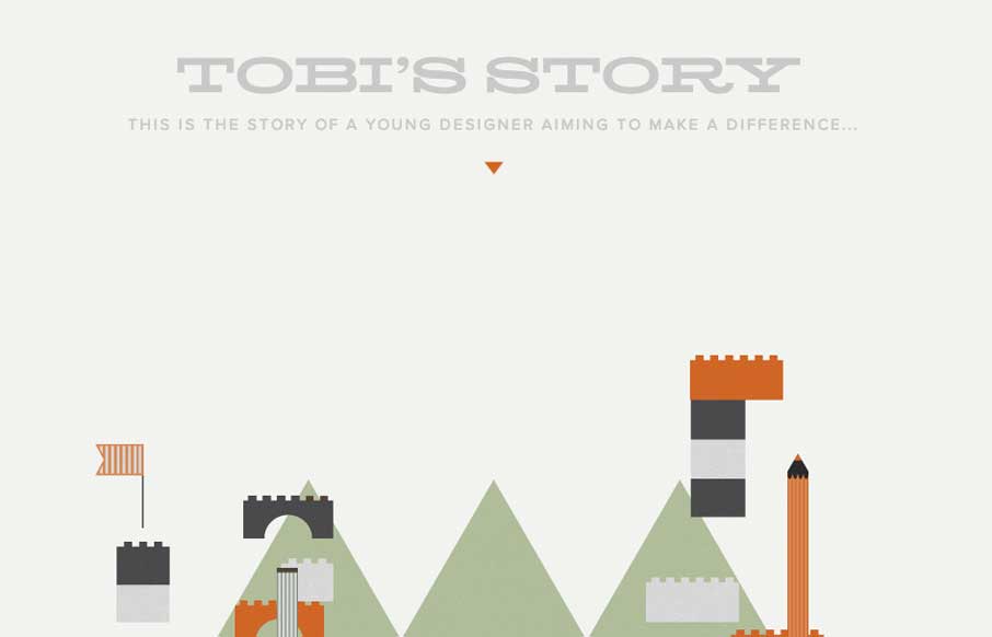
by Gene Crawford | Mar 10, 2014 | Gallery, Portfolio
The Toby’s Story site is just fun. There’s really no functional aspect to it, like a call to action or newsletter signup but you know what I don’t care. It’s cute and exists solely just to be a fun little experiment. I always love seeing that...
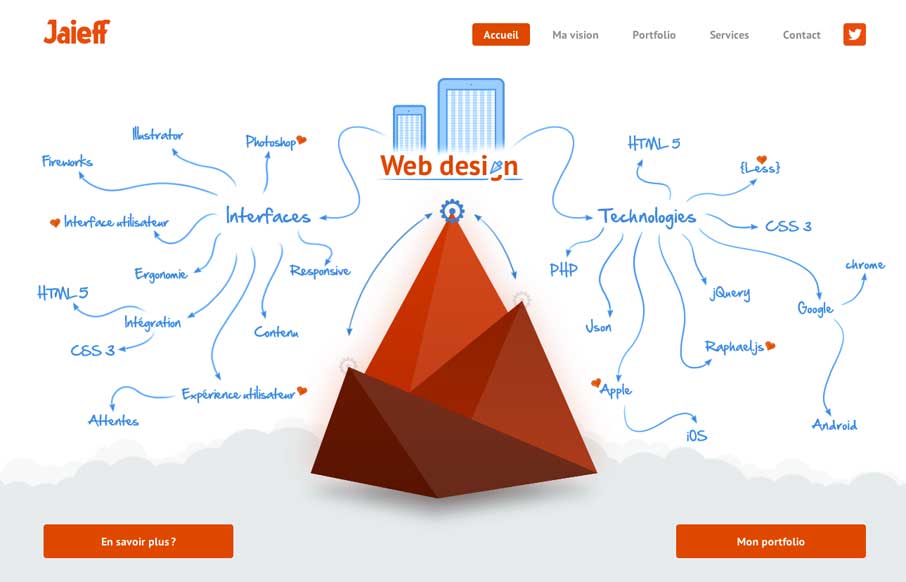
by Gene Crawford | Mar 7, 2014 | Gallery
There’s a lot to like about this website. But the best part is the interactive illustration on the home page. It’s pretty fun to mouse over that little gear and get all the arrows and stuff to show up. Also check it out on smaller screen widths, the stuff...
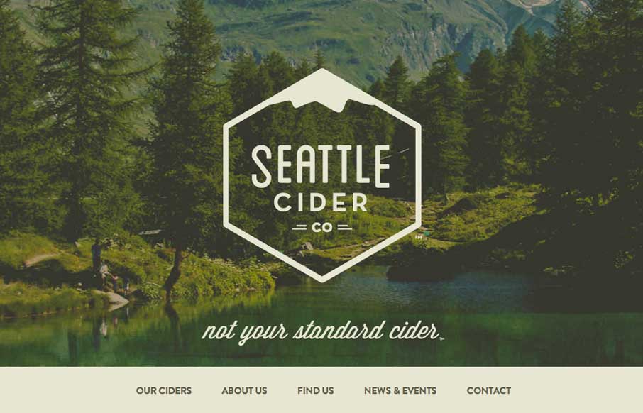
by Giovanni DiFeterici | Mar 5, 2014 | Food and Beverage, Gallery
The Seattle Cider Company website uses flat illustrations and simple interactions to control the narrative of the cider making process. The design style is hip and minimal with a few nifty tricks (like the slide-in fixed nav) and a lot of character. The narrative...
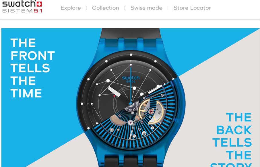
by Gene Crawford | Feb 25, 2014 | Gallery
Fun product page for the Swatch SI System Watch. It makes strong use of timed animated images of the watches, letting you get a sense of their tactile quality as you scroll. I also dig the map, click on a store location to see the way the map responds. It’s...
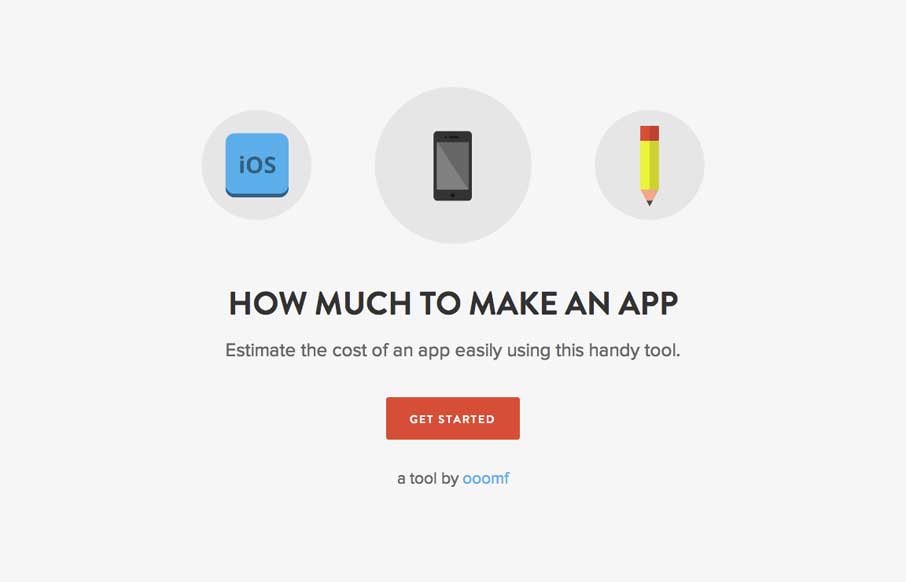
by Gene Crawford | Feb 24, 2014 | Gallery
This site/app is so dang simple it hurts. It’s beautifully done, you could use it to send to a prospect so they understand pricing across the industry. The icon work is great, coloring is great and there’s no barrier to use – you just answer...