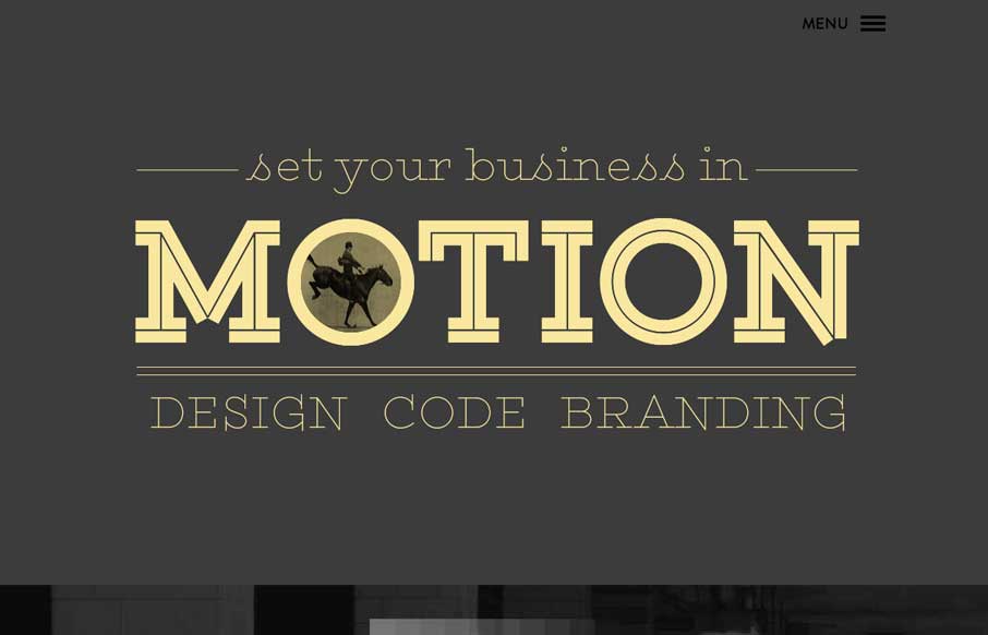
by Gene Crawford | Jun 10, 2014 | Gallery
Really beautifully illustrated and animated site. I love just about everything about this layout. Once again narrative in design wins out.
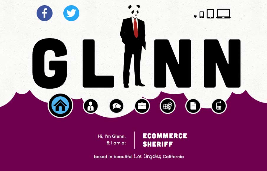
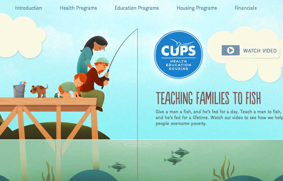
by Gene Crawford | Jun 9, 2014 | Gallery
You’re portfolio site is where you get to show off. Glenn get’s this and really show’s us some fun and how it’s done. Love this site. “Ecommerce Sheriff” is my favorite too.
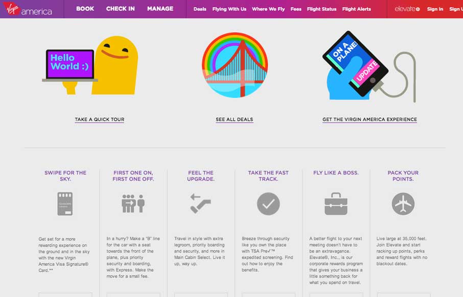
by Gene Crawford | Jun 9, 2014 | Gallery, Travel
Great new experience for the Virgin America website. These guys get it and it shows. Lovely stuff. They have a really great “get to know it” page setup too. Here’s a cool post about the experience too, read it up here.
by Gene Crawford | May 30, 2014 | Gallery
Cool, almost subtle use of animations to draw your eye on the page. I like the slide out nav (not the hamburger icon use 🙂 but how they’ve used the big graphic blocks as marquee elements in the nav itself. Clever.
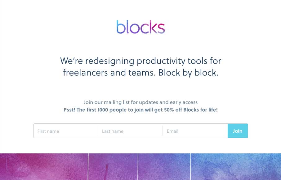
by Aaron Griswold | May 29, 2014 | Gallery
We hosted ConvergeSE this year in the Columbia Museum of Art (CMA). It was cool as we were running around, getting everything set up, whizzing past 16th, and 17th century paintings, to just stop and stare at the art for a few minutes – connecting to the past....