by Gene Crawford | Aug 27, 2014 | Gallery
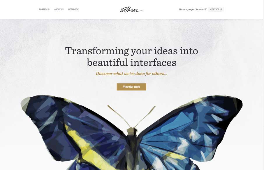
Really beautifully designed website from 31three- hint: their sites always are… I love the butterfly and how it’s used and the soft deckled edges under the main nav bar. Nice simple responsive design FTW.

by Gene Crawford | Aug 26, 2014 | Design Firm, Gallery
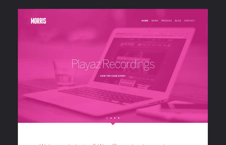
Cool vibe to this site design for Morris. I like the colors and they way the elements are presented. It feels kind of fresh and has that “mobile” vibe to it visually. Pretty neat.

by Gene Crawford | Aug 25, 2014 | Gallery
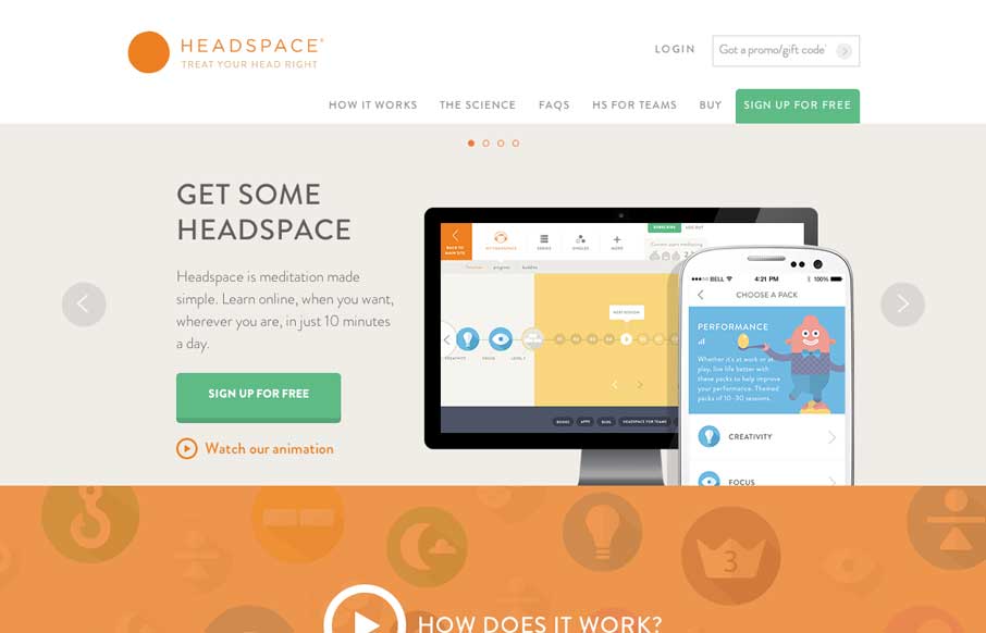
I love the look of this site. It has hard edges and a rigid typeface but it still keeps a soft feel to it all at the same time. It’s party color and imagery and rhythm that keeps it feeling open and inviting. Great work all around visually on this.

by Gene Crawford | Aug 20, 2014 | Gallery
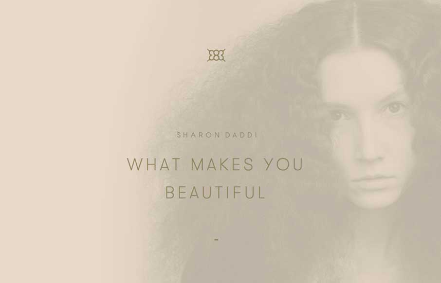
What a unique design for this salon. I feel like it’s really something different for what most people experience with their salon’s website. It’s subtle and very smooth feeling as you go through it to me.

by Aaron Griswold | Aug 6, 2014 | Gallery
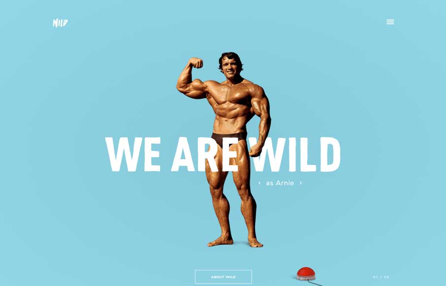
Um… yeah… where to start? Astronauts rotating around text? Parallax of a boxer being counted out? Wild navigation scheme that makes it fun to move around the site? Hamburger icon that animates into an X? Or the easter egg of all easter eggs – Arnie,...
