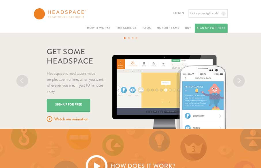
I love the look of this site. It has hard edges and a rigid typeface but it still keeps a soft feel to it all at the same time. It’s party color and imagery and rhythm that keeps it feeling open and inviting. Great work all around visually on this.


The Call to Action, Revisited
The Call to Action hasn’t changed in a decade, but the bar has. A fresh look at prominence, copy, mobile tap targets, and accessibility, with lessons from three major design systems.


0 Comments