by Gene Crawford | Sep 30, 2014 | Gallery
Neat layout and approach. Show some work, show what’s next, boom. I like it.

by Gene Crawford | Sep 30, 2014 | Gallery
I love this site design. I like the simple and clean nature of it. I like the hero graphics and the way the other sections are displayed. I can’t understand why the initial load of the page would hide the main nav under the hamburger icon though. Is it mainly to...
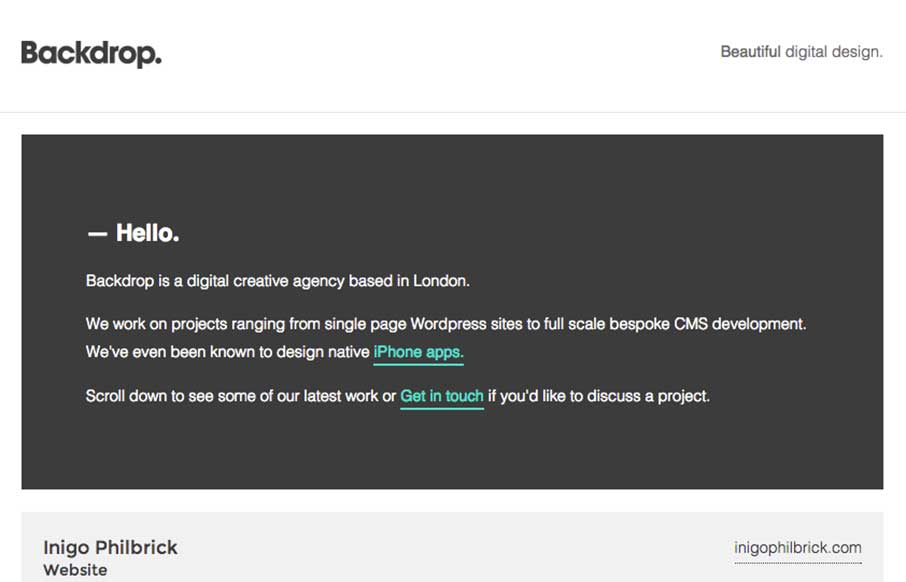
by Gene Crawford | Sep 25, 2014 | Gallery
Nice easy way to deliver a message. I can’t help but reminisce about splash pages when I see site’s that utilize big entry overlay designs like this. Submitted by: Gareth Evans @webfireagency Role: Project Manager We’ve tried to do something...

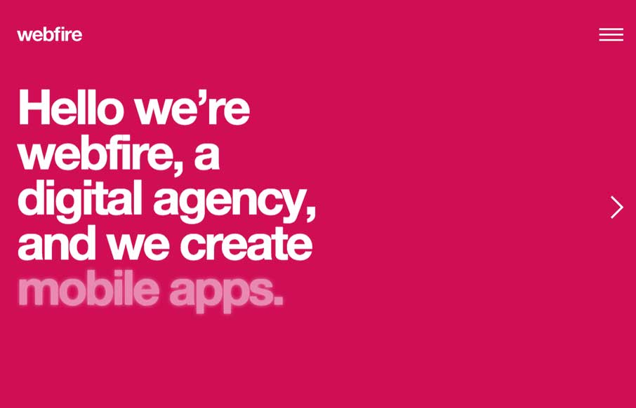
by Gene Crawford | Sep 12, 2014 | Gallery
Pretty cool feel to this site. I like the colors and the blocky approach to the layout visually. Pretty fast movement and interaction speeds as well which lead to it feeling faster overall to use.
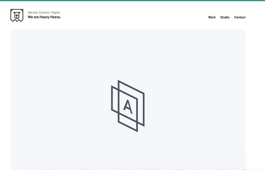
by Aaron Griswold | Sep 9, 2014 | Design Firm, Gallery
The ironic thing about Heavy Heavy’s website is that it is light. And in this case, light is heavy. Um.. that means that you can make a strong impact with a light and simple site. Instead of having a thousand animated gifs and CSS spinners, you can make a simple...