
by Gene Crawford | May 26, 2015 | Gallery
Strong grid design and some some solid/strong color makes this website shine for Frank Digital. I especially like the asymmetrical layout of the portfolio section on the home page. Designer: Frank Digital Sydney & Melbourne From the Designer: We create websites...
by Gene Crawford | May 20, 2015 | Gallery
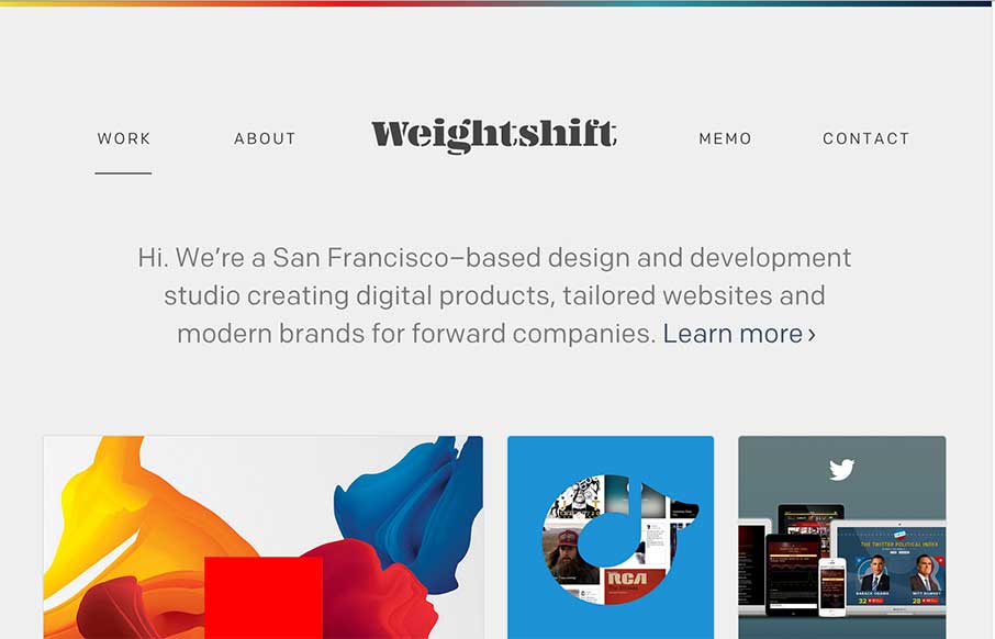
Every now and then Weightshift will rework their website. I’m in love with this version for sure – not that the past dozen were not good by any stretch. I love simplicity and the way this site has traveled down that path over the years is a work of art....

by Gene Crawford | May 12, 2015 | Gallery
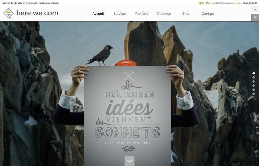
Pretty tight agency website. It has all the hallmarks of a good agency site and is also very well done. The grid is strong and easy to scan and there’s enough little pieces to make it feel good as you scroll and interact with it. They also have some really...
by Gene Crawford | May 11, 2015 | Gallery
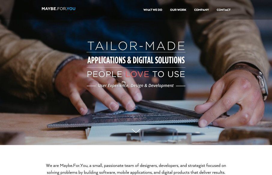
I’m starting to see A LOT of websites that look really similar in their structure and layout. Leaving the differentiators to the photography and copy. Sometimes someone will put in a bit of elbow-grease and make the interactions really shine. The Maybe.For.You...
by Gene Crawford | May 6, 2015 | Gallery
I like the illustrations, like the ice berg and some of the sub sections of this website more than the overall layout itself. It’s a strong website through and through, but some of it formulaic, then when you discover some of the sub sections you see what it is...