Web Design Inspiration Curated
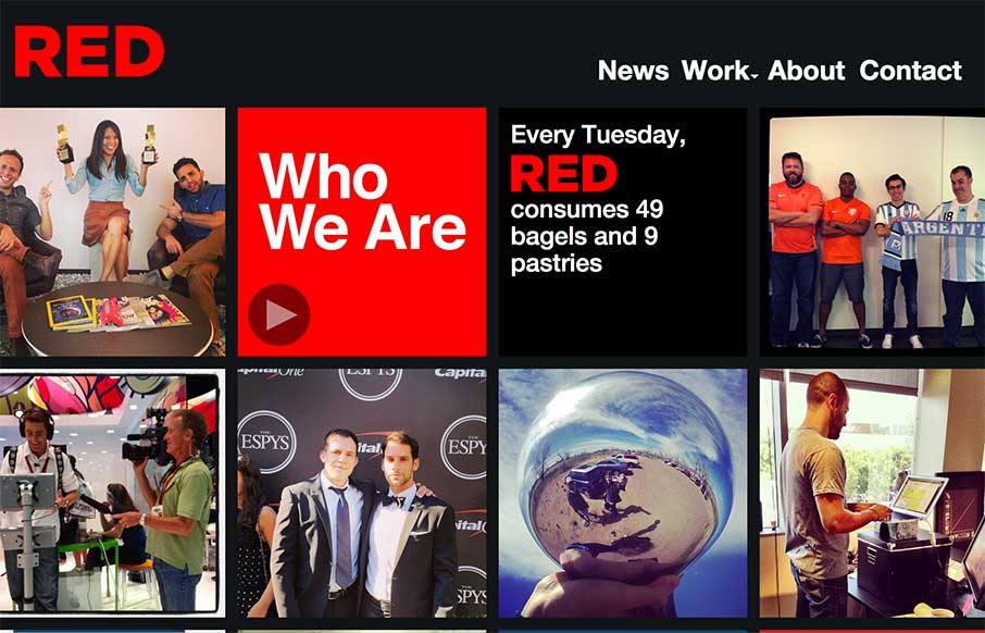
RED
The way the site is built out of squares that adapt to the width of the browser screen (see what I did there?) is really neat. It's simplicity but not overtly done. The nav reflects the simple approach to the layout too which is nice and clear.
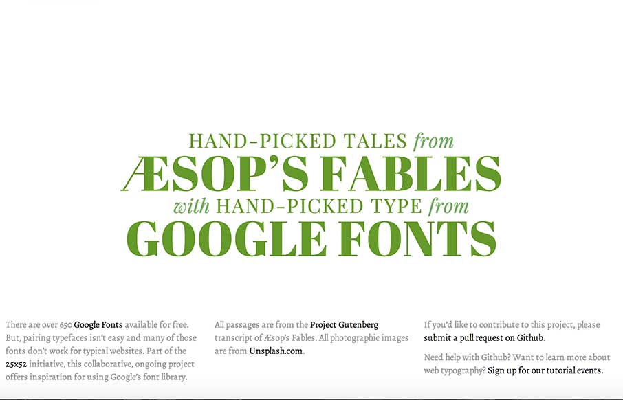
Google Type Project
I'm not sure that I can do this site justice with a few short words... but it looks like some cool people got together and are doing some cool things here and in the 25x52 Initiative. Check the page out - and the people that are behind it, and you'll see what I mean.
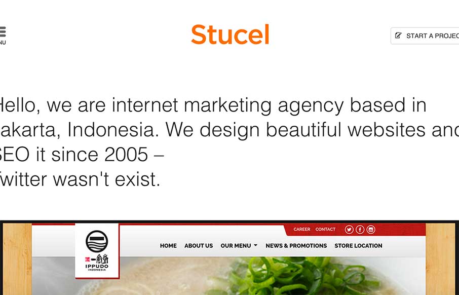
Stucel
Good looking site out from Stucel out of Jakarta. Good illustrations and a different look on the About page (hover over each of the employees). Plus - anyone that can get good copy with more than one language is ahead of the game.
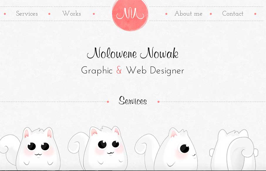
Nolowene Nowak
What a great design all around. So much character and clever visuals built into this thing. I love just about every piece of it.
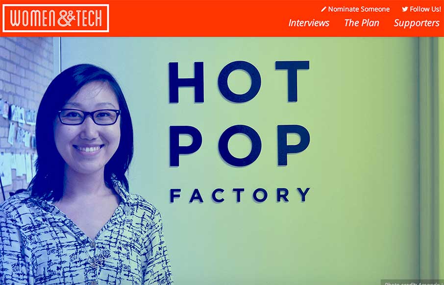
Women and Tech
In the style of The Great Discontent the Women and Tech website and interview series is well done. The website is put together very well, the layout is editorial and clean letting the content be the main focus. Great reading and good stuff all around here.
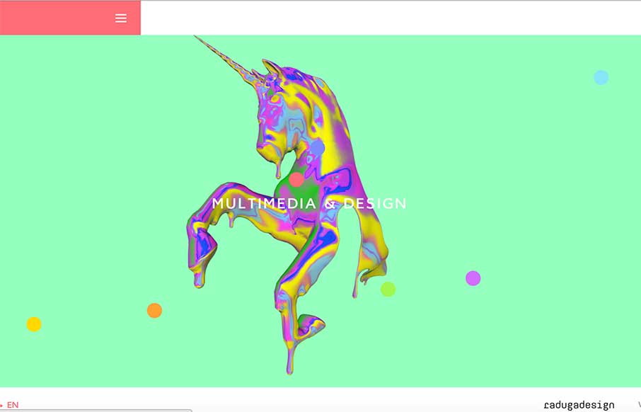
Radugadesign
Some crazy imagery and even crazier interactions. Really just go play around with it and see what you think. What do you think? Submitted by: Ivan Nefedkin @radugadesign Role: Designer & Developer
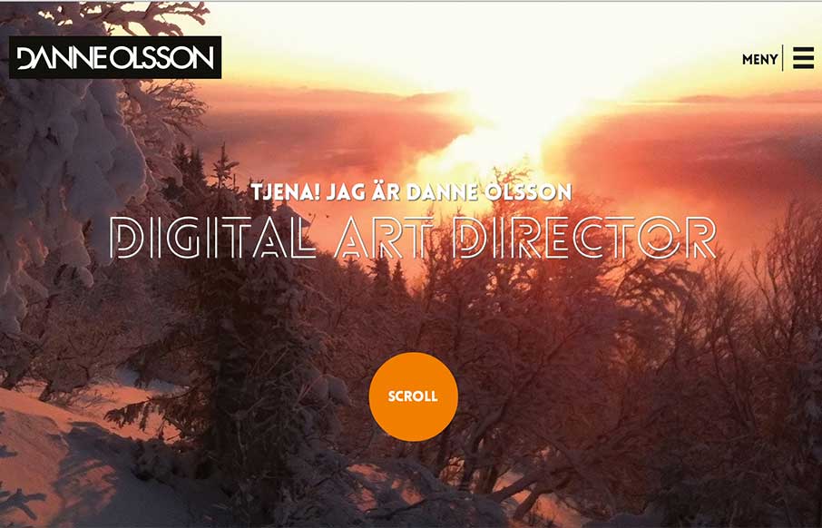
Danne Olsson
Really like the photography and typography on this portfolio website. It's smooth feeling to me as I scroll with it. Also, you gotta dig the loch ness monster on the contact page there.
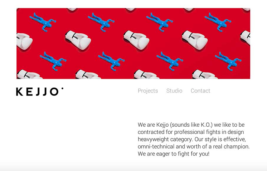
Kejjo Studio
Love the header/hero image! I also really like the subtle shift in the header nav that scrolls up into position then fades away as you get into looking at the designer's work. Love this site so much. Submitted by: Kejjo Kejjo We are Kejjo (sounds like K.O.) we like to...
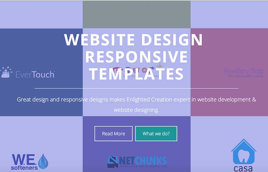
Enlighted Creations
Very nice experience scrolling this site. I like the header/splash area and then how it flings you down into more content.
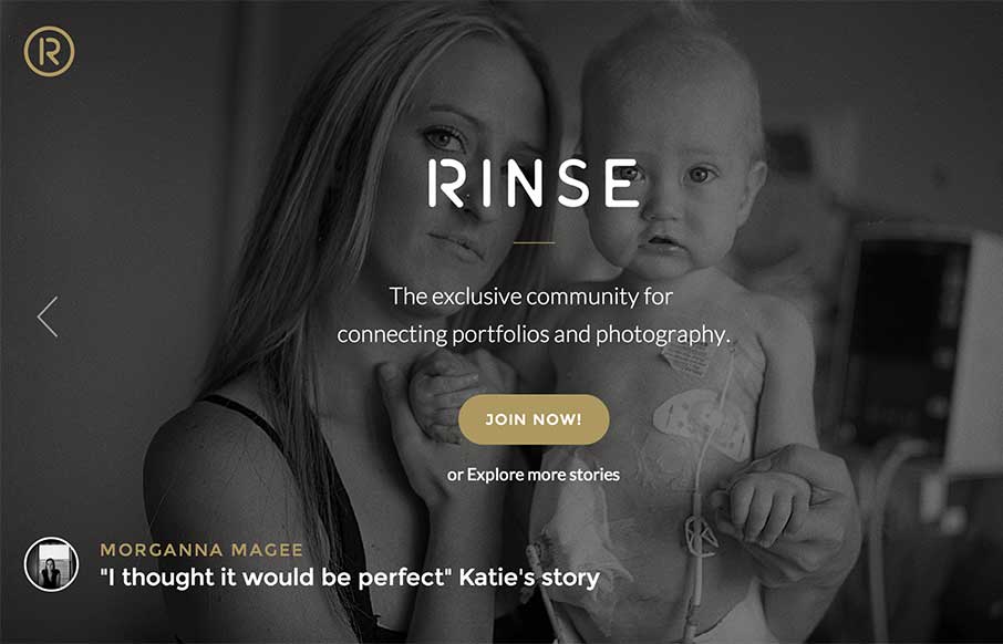
Rinse
I really dig the purpose of this app/community. Though first I dig the design of this thing. It's simple and compact and really feels good as you use it. Give it a try folks.
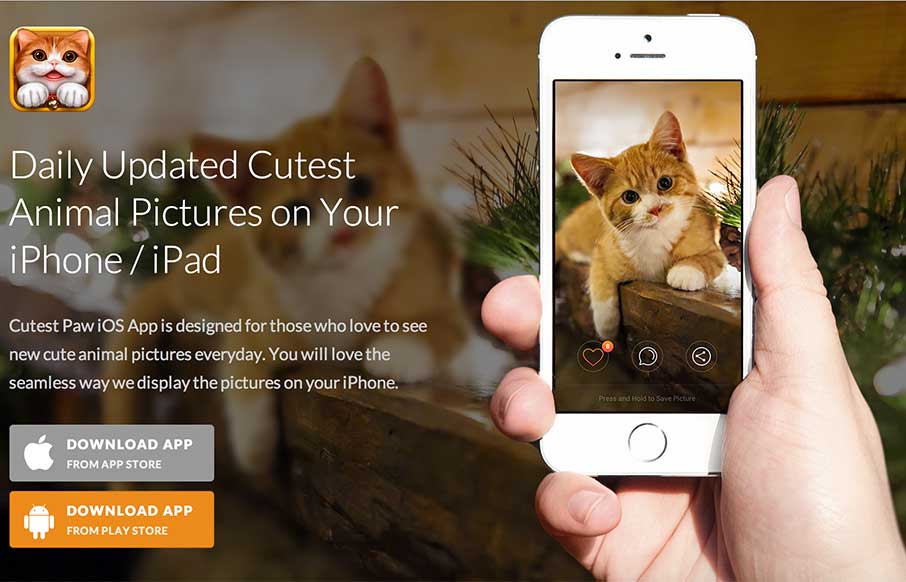
Cutest Paw
Awhhhhh..... If this app wasn't free, I'm sure my family would spend all our money to obtain it... but that's not important now. The app product page itself is a great design - flows easily - has great parallax work and good screen shots - and a whole lot of cute...
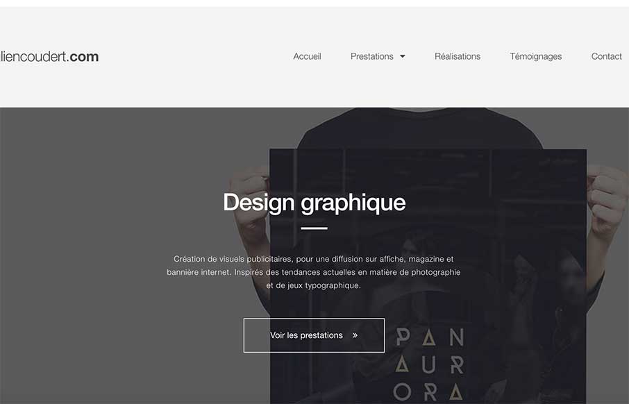
Julien Coudert
I really like the asymmetrical feel to this site's layout. It's like not and is at the same time. I also like the subtle responsive design decisions he's made as you scale the page down. Julien Coudert, french graphic designer working in webdesign and branding for...
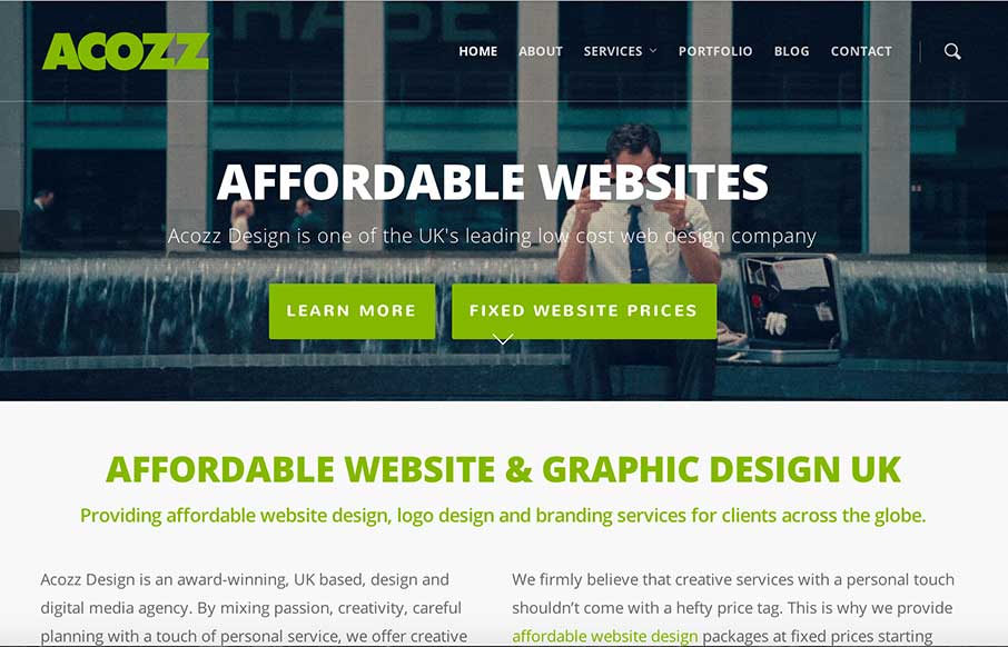
Acozz Design
Pretty clever and simple looking site for the web design agency Acozz Design. I dig the colors and the amount of content they've developed is wonderful. I particularly like the animated gif work on the headers. Though i'm not wild about the transition screens as I...
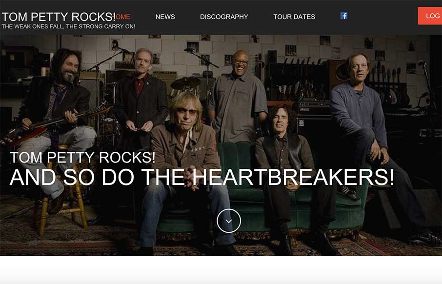
Tom Petty Rocks!
Man I love some Tom Petty, so does this guy. It's a nicely designed and executed responsive design featuring one of the best subjects. I love it. If you like Tom Petty, you'll love tompetty.rocks! Formerly gonegator.com which was reviewed by USA Today and The Atlanta...
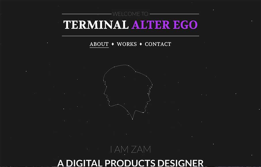
Terminal Alter Ego
I'm digging how this page scrolls, the way you go from the black background to the white with an angle down the page. Good stuff. Submitted by: Zulficar Ali @zulficar Role: Designer & Developer
300 Entertainment
Pretty cool experience with the content of this site. It took me a bit to figure out what this website/company is about, but when you do it's cool. Make sure you watch the video - and see the "live" news feed at the bottom of the home page - about page is cool too.
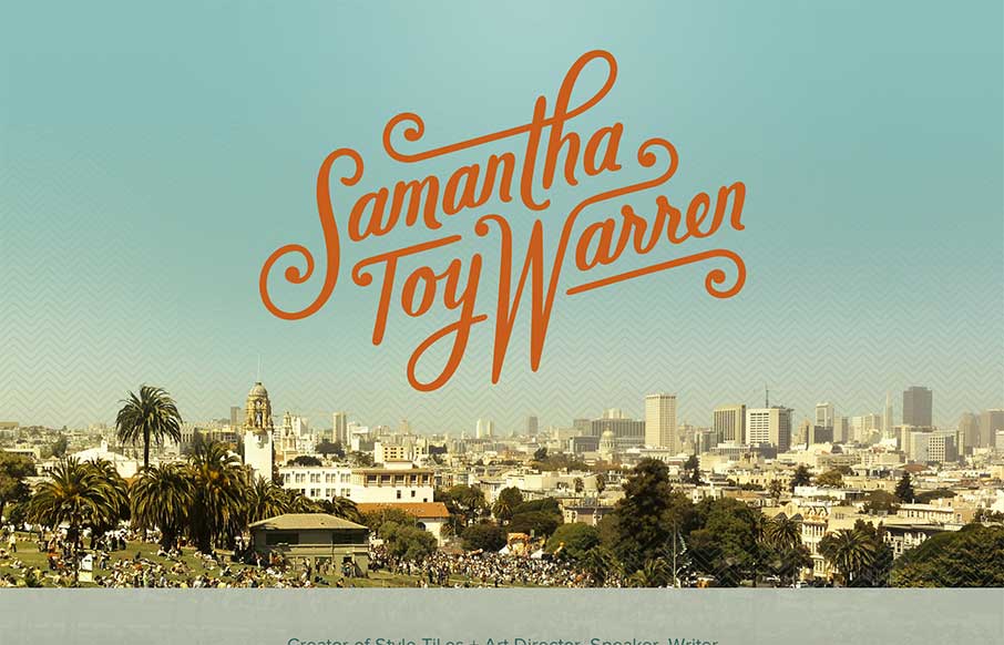
Samantha Warren
Nice simple site to tell us what Samantha does. Love it. I really dig that logo type of her name. Super badass. Then the geographic photos worked into the layout help tell the story of where she lives and stuff. Smart work.
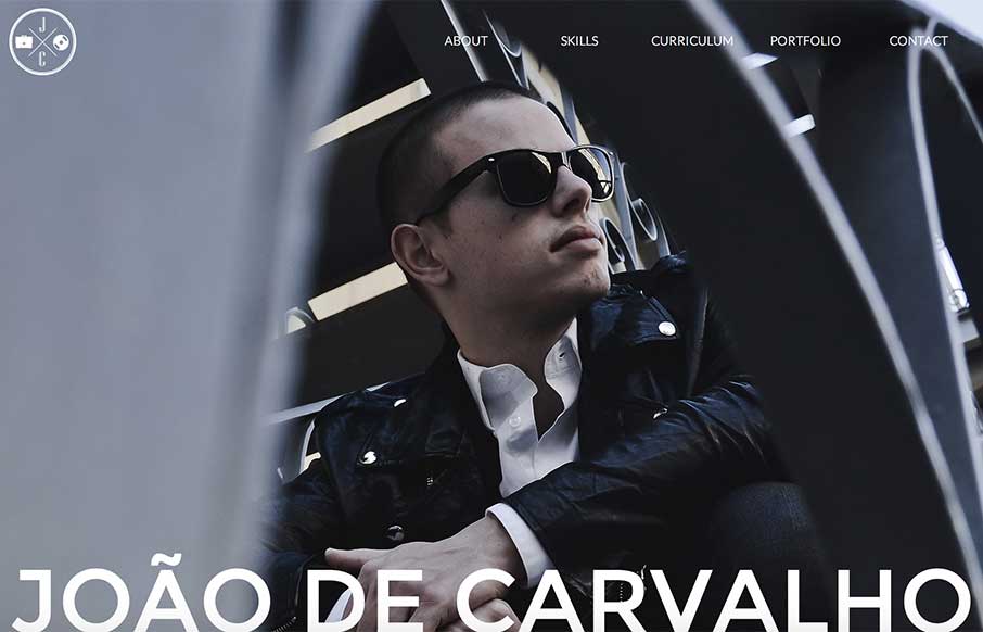
thejoao.com
I like the imposed high quality feel to this design. From the photography to the tight typography it has a great vibe. I especially like the languages section/design thing. Smart.
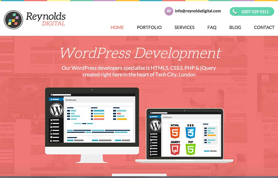
Reynolds Digital
Nifty and simple page layout for the Reynolds Digital website. I like the portfolio pieces' hover state, how it slides down with a description and linkage. Submitted by: Mollie Potter "Reynolds Digital is a web design agency located in the Heart of London's Tech City....
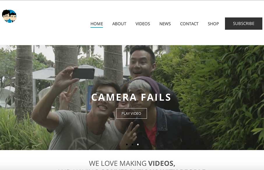
JinnyboyTV
Clean looking layout for JinnyBoyTV's website. It has the basics covered with being Responsive and utilizing some common design patterns for smaller targeted screen widths too. Decent stuff! Submitted by: Chong Ching Twitter: @chongchingOoi Role: Designer / Developer
EMAIL NEWSLETTER
News & Articles
UMS Book Club: Ethan Marcotte
 Join us August 24th at 2:00 for a live discussion with “Responsive Web Design” author Ethan Marcotte, it’s a members only thing so make sure and get signed up.
Draft Episode 02: What does a “designer” do?
 Draft is a podcast about the craft of designing for the web, in this episode we explore what a designer does. Dissecting a quote by Dr. Don Norman. Featuring Giovanni DiFeterici and Gene Crawford.
Chat Session: Allan Branch
 Talking with Allan Branch of LessAccounting, LessEverything, LessConf, LessFilms. about their Book and how they approach business in general.

HARD WORK. CLEAN FUEL. NO EXCUSES
Use “WARRIOR2023″ for 10% off.