Web Design Inspiration Curated
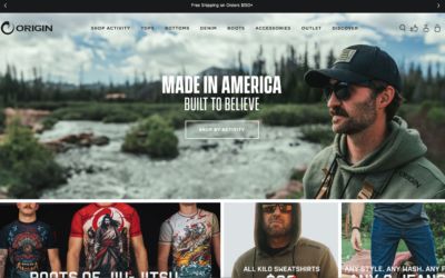
Origin
Man OH man, I love me some Origin and I also love me some eHouse Studio! Wonderful when worlds you love can collide like this. "Migration to Shopify Plus & creating a frictionless, intuitive, and easy UX through a more simplified UI" - eHouse Studio Go and buy...
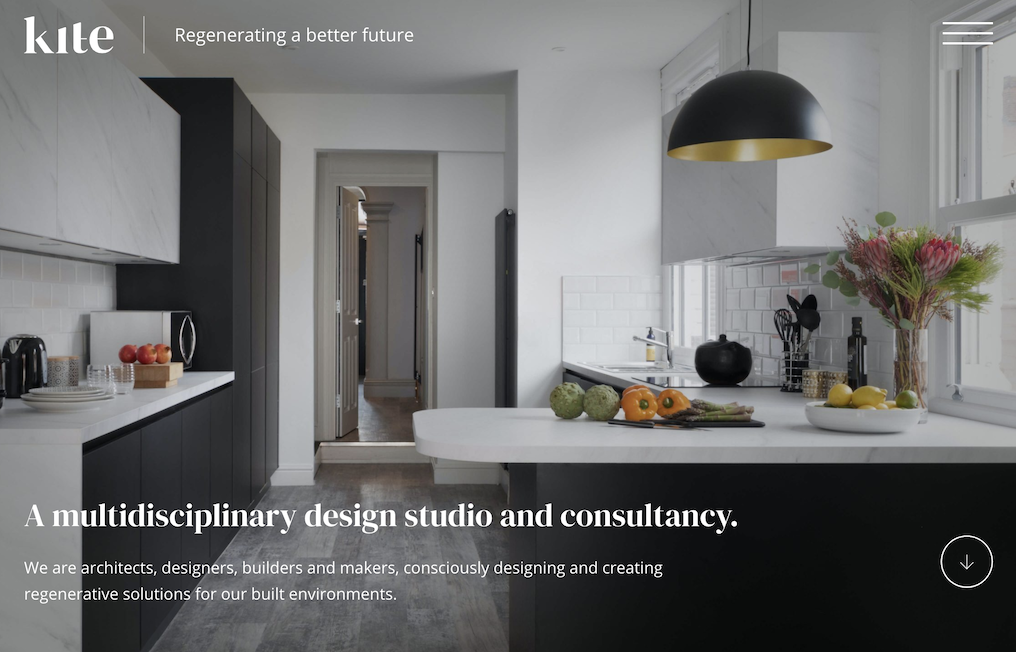
Kite Creative
Plug & Play is a creative design agency with an innovative and technically skilled team. They are passionate about creating impactful digital experiences and embrace high quality and high performance design. Plug & Play specialise in Web Design, Web...
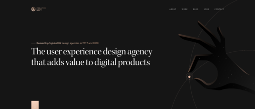
Creative Navy UX Agency
This website is built with respect to user needs. Flawless navigation, minimalist colour palette, and high-quality, original content. It is memorable and manages to inspire user trust.
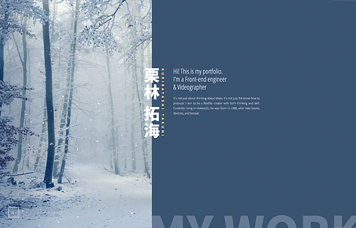
Kuribayashi Takumi Portforio
This is a portfolio site of Takumi Kuribayashi, a web and video creator living in Japan.
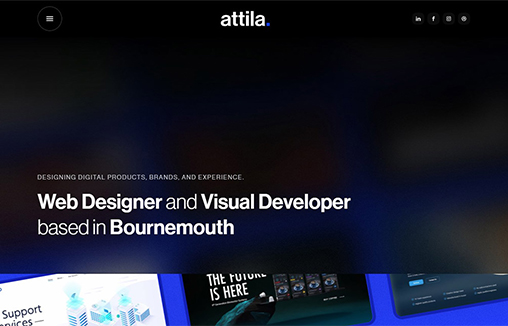
Attila Vaszka – Portfolio
I'm Attila Vaszka, a Web Designer based in Bournemouth (UK) and this is my portfolio website built in Webflow.
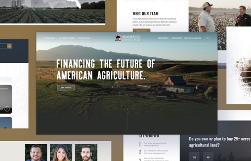
AgAmerica
AgAmerica's mission is to provide a financial structure that allows the farmer to thrive in good times and to sleep well during tough times.
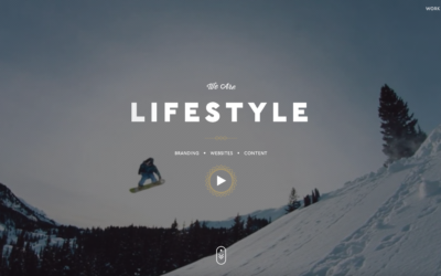
TMBR
Very cool "outdoor" vibe on this agency website. They really hit their niche visually and I just love it.
faucethead
Life is experienced through moments of personal connection — We design those moments.
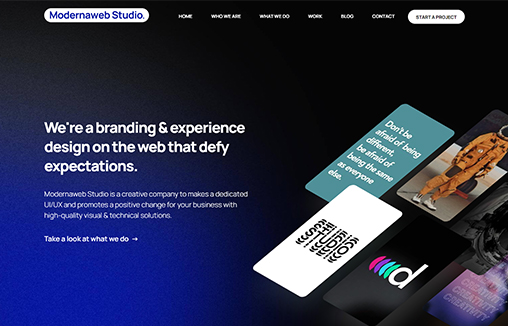
Modernaweb
Modernaweb Studio is a creative company to makes a dedicated UI/UX and promotes a positive change for your business with high-quality visual & technical solutions.
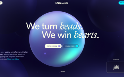
Engaged
Intense interactions here. I like the way it feels as you mouse around but there may be a bit of delay for your average web-user. Much like the "flash days" this site has all the vibe I used to dig.
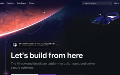
Github
When was the last time you checked out the Github home page? It's been a hot minute for me, and I was pleasantly surprised when I did. Good stuff here.
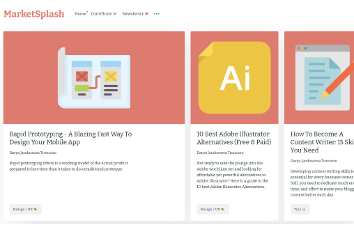
MarketSplash
Our mission at MarketSplash is creating the most complete guides on digital marketing and digital design topics.
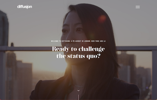
Diffusion PR
Diffusion is an international PR agency in London, New York and Los Angeles, enabling innovators to challenge the status quo with communication that confers commercial advantage.
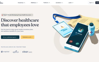
Nova Benefits
Solid and corporate looking design here. I really like the precise detail work with the drop downs and "static" animation. Clean and crisp, it is what it needs to be.
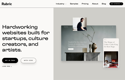
Studio Rubric
I like the straight forward approach to this design/layout. It's simple in it's performance but very clean and excellently produced. Solid work here.
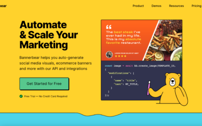
Bannerbear
Clever design aesthetic where the details are "flattened out" like they are. It gives it all a unique branded feel. Then the illustration work is simple and fun. Feels all perfectly fit for a marketing platform to get you to feel open and interested in it.
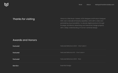
Vilmar Fernandes
Portfolio of Vilmar Fernandes, UX/UI Designer—Product Designer with over 17 years of experience in the digital industry.
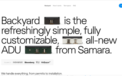
Samara
Very cool type heavy layout but with some nice grid work and thorough details to pull it all together.
Superdope – Mockup generator for creatives
Superdope is a mockup generator for creatives and makers.
Generate premium mockups with your design in seconds.
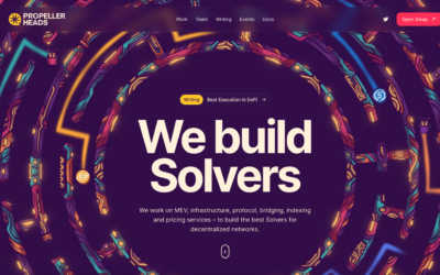
PropellerHeads
Sometimes design just needs to be FUN. This website is bolstered by the fun and visually loud illustration work. It's simple in execution but hard to do well and they pull it off. Love it.
EMAIL NEWSLETTER
News & Articles
Free Download: Technology Line Icon Set
![]() Thanks to the fine folks at Vecteezy we’re able to give you guys a free set of their Technology Line Icons. Go get e’m and enjoy.
Thanks to the fine folks at Vecteezy we’re able to give you guys a free set of their Technology Line Icons. Go get e’m and enjoy.
BizCraft Episode 51: How society & ethics can affect your business
 Carl and Gene talk about how society and all its bullcrap can affect your business for better or worse.
BizCraft Episode 50: The one where we look back over the top 10 episodes
This is the 50th episode of the BizCraft show. How are we only at 50? Well, we don’t really know, but we’ve had a blast so far and thought we’d take a show and just look back at the most listened to episodes.

HARD WORK. CLEAN FUEL. NO EXCUSES
Use “WARRIOR2023″ for 10% off.