Web Design Inspiration Curated
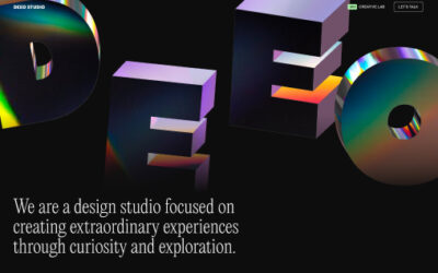
Deeo Studio
The website features an interactive 3D header made with Spline and fully developed in Framer.
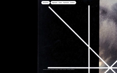
Somehow
Pretty interesting interactions and interplay with the home page/landing page. Worth a quick study.
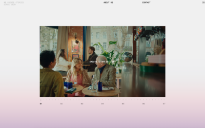
Wildy Riftian
Winner of the Best Visual Design Framer award: "Great design seamlessly blends color, typography, and layout. Wildy Riftian impressed us with bold creativity and refined beauty. This highly interactive layout combines elegant design with innovative navigation and...
The 1
Winner of a Framer Design of the Year award for Best Interactions: Interactions connect designs and users, turning static sites into engaging experiences. Analogue Studio mastered crafting interactions that were both functional and irresistible.
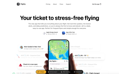
Flighty
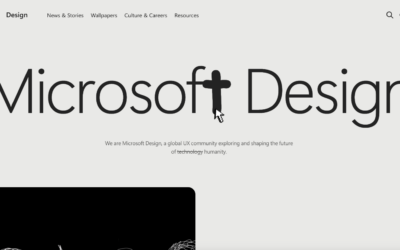
Microsoft Design
A great design where the only things we get visually are the things we need to consume the content. I never thought i'd get a real minimal approach like this form an org like Microsft. Bravo and great work.
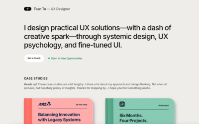
Toan To
I love the minimalism of this design. It has just the things it needs to communicate what it needs to convey. Then there are some super nice details and creative elements. I also LOVE the book interaction pieces.
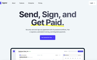
Agree.com
Super clean and professional design. It's minimal(viable) but also deep in almost unnoticeable details. Also, pretty rad product.
Ciel Rose
Some really intriguing design here. I really like the video player and how it changes shape as you scroll with it. Super cool. Then the sub page layout and approach is also interesting. Makes you want to look at it all again. Nice job.
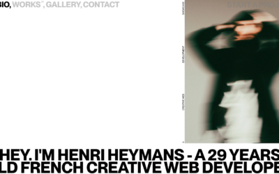
Henri Heymans
Nice brutalist inspired design. I love the expression involved with this style, but I always wonder about it's effectiveness.
200pct
Love almost everything about this. I haven't seen that typeface used in a while and I LOVE it. It's retro but not totally. I love the colors as well. Bravo.
Arago
Super interactive, 3D elements and scroll timed animated. Pretty well done and interesting to study. Give it a look
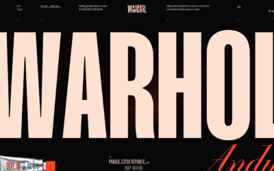
Warhol
What a fun design. I love this, the super oversized type and then the interactions as you scroll. It tells a story and presents the art in the best light. Bravo.
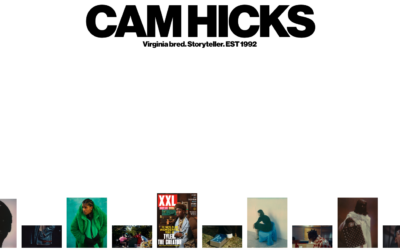
Cam Hicks
Really simple portfolio layout/presentation. It's very clever though. I love minimalist design, maybe too much. 🙂
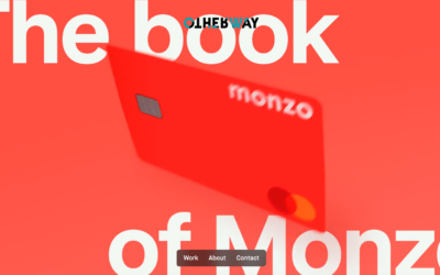
Otherway
Fun design here. I love the "video reel" that's presented as a "hero" area. Solid little nav presentation too.
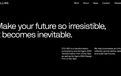
Collins
This design isn't going to blow your mind, but I like it because of the study of using the grid we can gain from reviewing it. I also like the 'dark mode' approach to it as well.
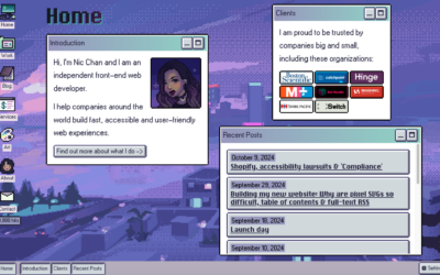
Nic Chan
Very fun design. I love the niche look and feel and it's sure memorable. I can't speak to the technical quality but I think the design and presentation is aces!
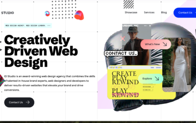
ID Studio Web Agency
This website is the company portfolio of ID Studio Web Agency a London-based web agency. The core objectives are to present our showcase and services to impress and attract new clients.
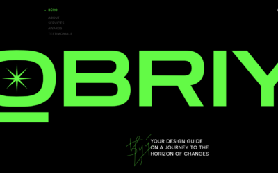
Obriy Design Büro
The website was designed and developed by Obriy Design Büro’s team. The user interface conveys brand style – a bright green accent on a dark background with 3D accents. Made on Webflow
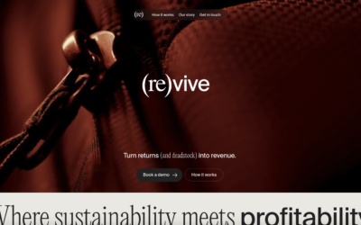
(Re)vive
Beautiful design here. I love the bold imagery and clean lines of the chosen type. The small nav design is cool, I dig it, but I wonder if it really communicates "navigation bar" to most people? Thoughts on it?
EMAIL NEWSLETTER
News & Articles
7 Freelancing Trends For 2017
The business of freelancing is changing rapidly; anyone active in the industry can see it. My own experience leads me to see certain trends that are already in effect, and are poised to really take off in 2017. Some of the freelancing trends of 2017 will help us, and...
Can You Make This Look Pretty?
One thing not to ask a designer and three reasons why It happened again yesterday. I was working through the details of some random user interface problem, and a new email landed in my inbox. As soon as I read the harmless subject line, my heart sank a bit. I’d been...
UX: Don’t Hulk Smash Your Users
It’s hard being a superhero. Take The Hulk. The Hulk can lift 150 billion tons.* The Hulk can use his thunderclap to blast away enemies. The Hulk can heal himself in seconds. But! There are things the Hulk can’t do. The Hulk can’t go on dates, do needlepoint, or wash...

HARD WORK. CLEAN FUEL. NO EXCUSES
Use “WARRIOR2023″ for 10% off.