Web Design Inspiration Curated
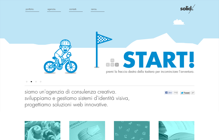
solidstudio.it
We are a consulting creative agency.we develop and manage systems of visual identity, Innovative web design solutions. Submitted by: Maurizio Cascio soldistudio.it is a, well, solid design, if you'll excuse the pun. The designer(s) paid a great deal of attention to...

soulmedia.com.au
We've worked really hard on this new version of our site to use HTML5, CSS3 and javascript to create an interesting, exciting and user-friendly experience (with a bit of humour) for our potential new clients. Submitted by: Daniel Ogden @Soul_Media Role: Designer &...
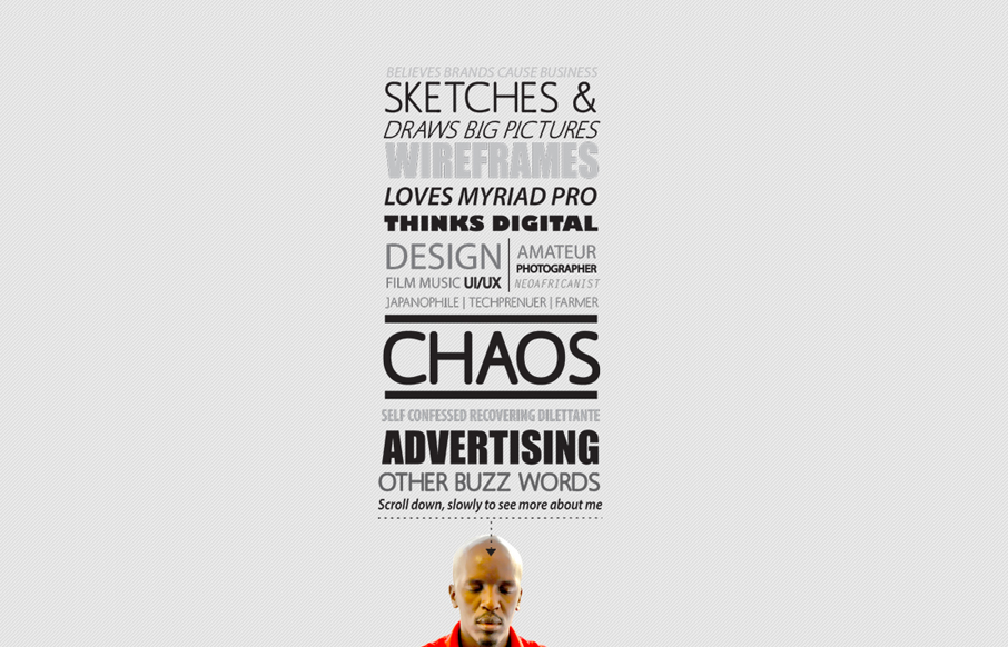
chaos.co.ke
Submitted by: Charles Gichuki @kibee Role: Designer & Developer Way to show off the big guns! Don't get me wrong, I know what you are thinking... all the usability problems, the possible accessibility issues, etc. But, seriously, this site is a great example of...
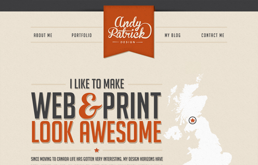
andypatrickdesign.co
A personal portfolio site with a fun look at the changes taken in my design career... by plane. Submitted by: Andy Patrick @handyandydesign Role: Designer & Developer I really dig the type work on this website, it has a ton of character even if the color palette is...
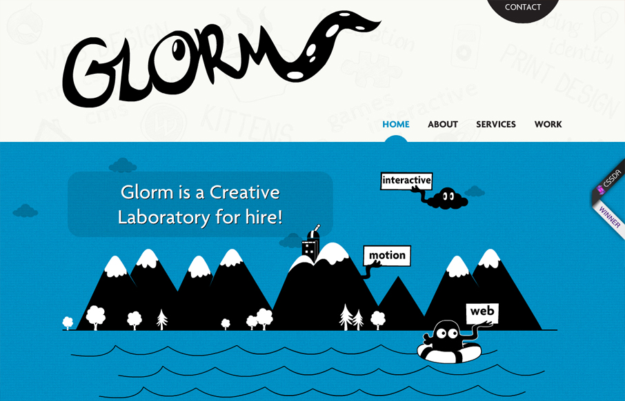
glorm.com
This site is hilarious and incredibly entertaining. After 10 seconds you get a real sense of what they do and how they do it, which is perfect for a portfolio site. It's also a perfect case study for multiple types of web based animation techniques. Some of the...
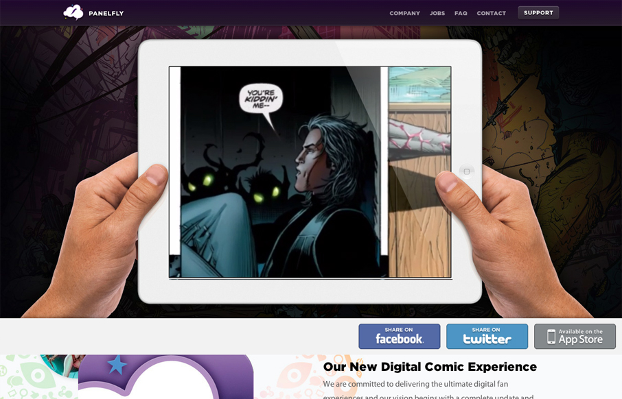
panelfly.com
Introducing the new Panelfly Website, this showcases the release of our new app! Submitted by: Clinton Halpin @clintonhalpin Role: Designer & Developer panelfly.com is a lushly colorful site, full of energy and movement. I love the panelfly's palette; dominantly...

squareup.com
I love the super simple direction of the Square App home page. It's deceptively simple in that there's one thing they want you to do, signup. But it's done with a slideshow that loads in different signup options with each type of product and it's a slick way to...
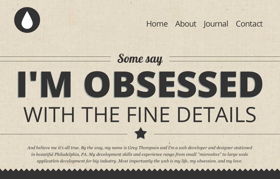
thegregthompson.com
This is my site, and I'd like to show it off. I'm very proud of it, it's fully responsive and use HTML5/CSS3 framework. Submitted by: Gregory Thompson @thegregthomp Role: Designer & Developer This is a great type-based, responsive site. The copy is engaging, but...
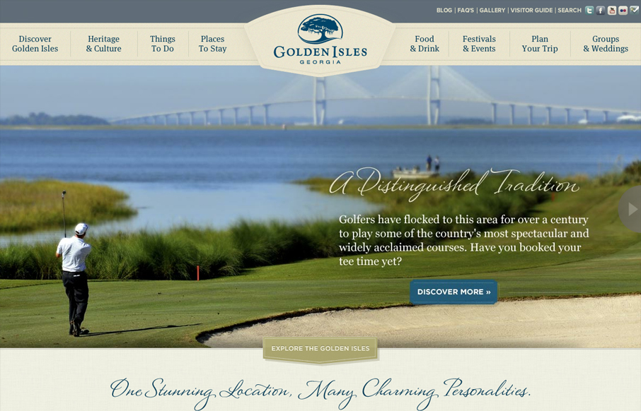
goldenisles.com
This is a very thorough responsive design solution. The main navigation changes alone are worth reviewing in some detail. Plus there is just a ton of info/elements on the home page that get handled well through each screen size transition.
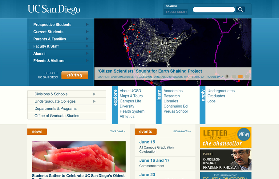
ucsd.edu
The UC San Diego website is very modular and square which is softened up a bit by the colors and a few slightly rounded corners here and there. There are a few sections of the home page that fall into a sort of "i'm just tired of designing" sort of vibe, like all the...
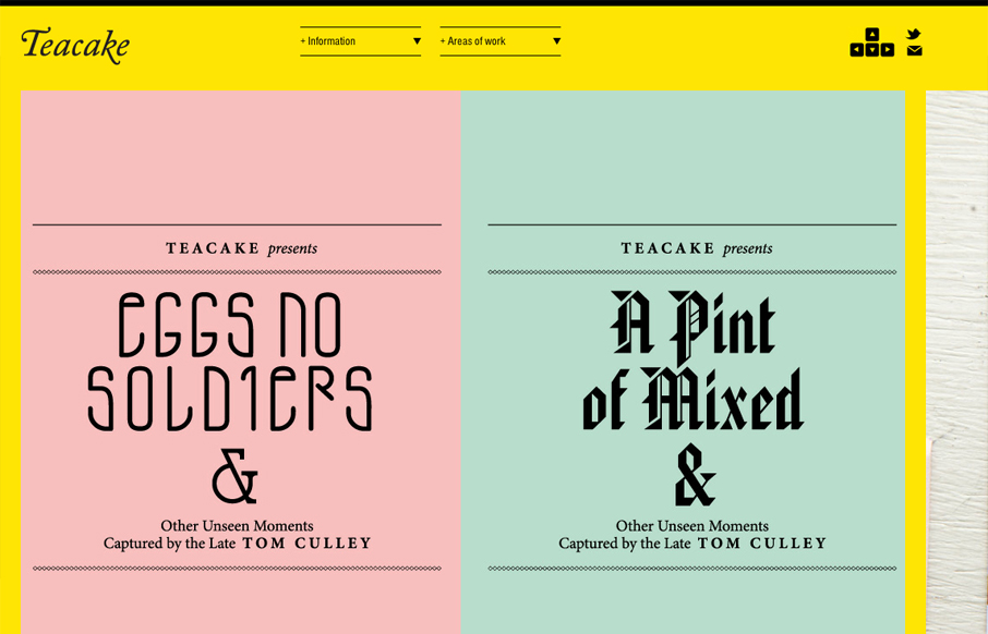
teacakedesign.com
I really enjoy teacakedesign.com because, while the layout and design present the work beautifully, the main thrust of the design revolves around making it easy for a visitor to navigate through the work. On teacakedesign.com, I enjoyed the ability to move through the...
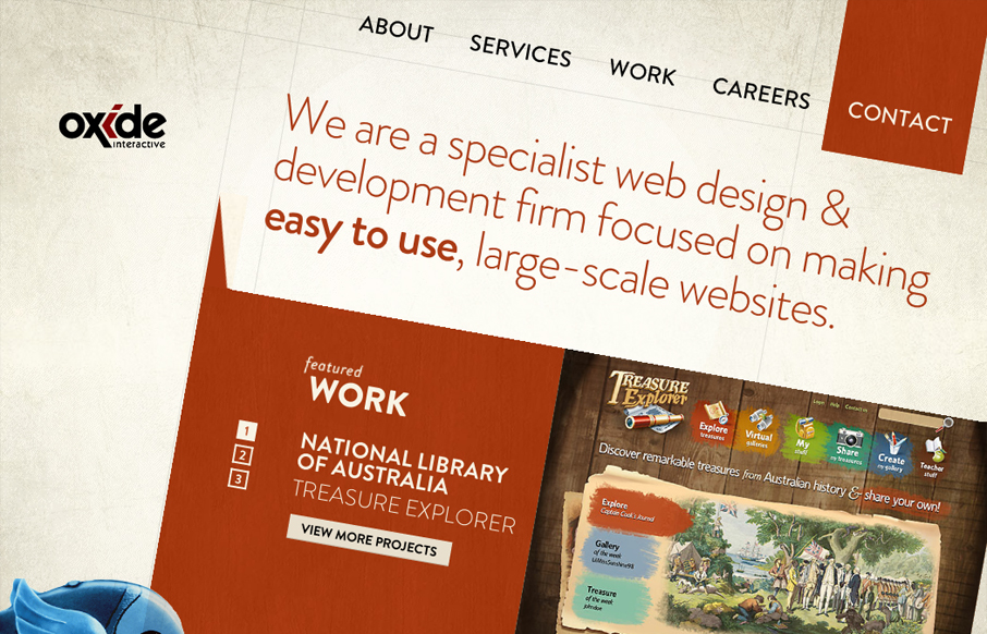
oxideinteractive.com.au
What a brilliant idea, looks great and works well with rotation. Even better they make a mobile friendly version too, a smart and thoroughly enjoyable design.
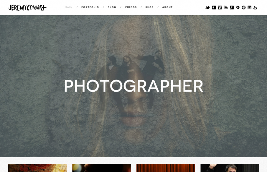
jeremycowart.com
jeremycowart.com is a great site to show off Jeremy's work. The homepage is striking in its boldness and gives a direct and immediate view of some of Jeremy's best work and the rest of the design is bold, minimal and progressive. The use of masonry doesn't hurt either.
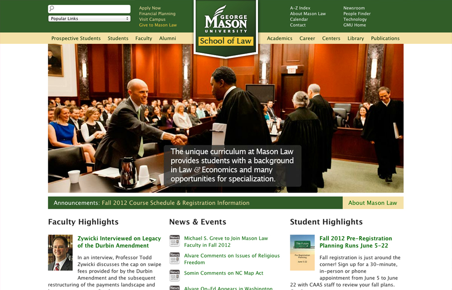
law.gmu.edu
University websites are a great place to study how large sprawling organizations with tons of content handle things. In this case the change in navigation design is largely from the wide horizontal nav structure with drop-down sub elements to the iPhone screen sized...
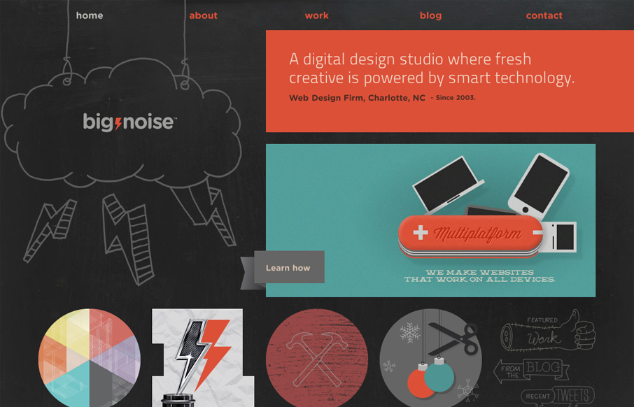
bignoise.com
Today, I'm playing the hometown card and giving a shout-out to Charlotte's own digital design studio Big Noise for their sweet website. The illustrations are what really sell me on the site. They're fun, there's a ton of them, and they really give you a sense of the...
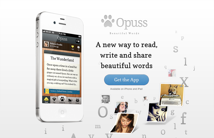
opuss.com
Tons of app sites have pretty much the same structure. On one side of the layout, a large image of an iPbone (of course, with the app onscreen) dominates the composition. On the other side of the layout, the main tagline tells us how the app will change our lives....
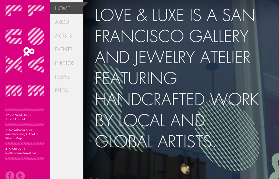
loveandluxesf.com
What a great website to study the different screen size experiences with. I love the three major size designs here. The wider has the nice nav inline next to the logo area and then as you scale in it slides under the logo. With the final iPhone sized screen having the...
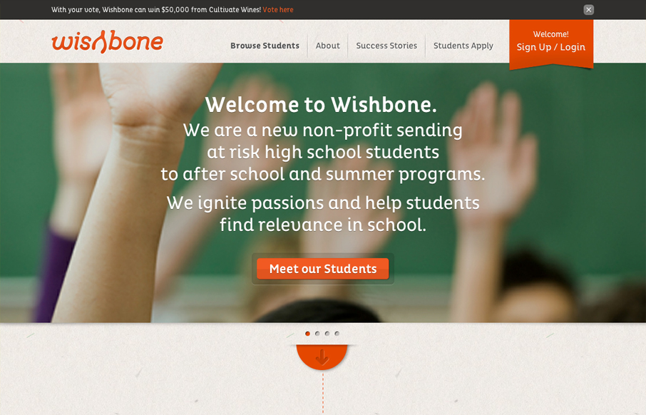
wishbone.org
Wishbone.org is a very cool site. Wishbone is a project that revolves around educating and retaining at risk students. You've got to love people who want to help educate our kids, so ten points for that. In addition to that, wishbone.org is a tight design, full of...
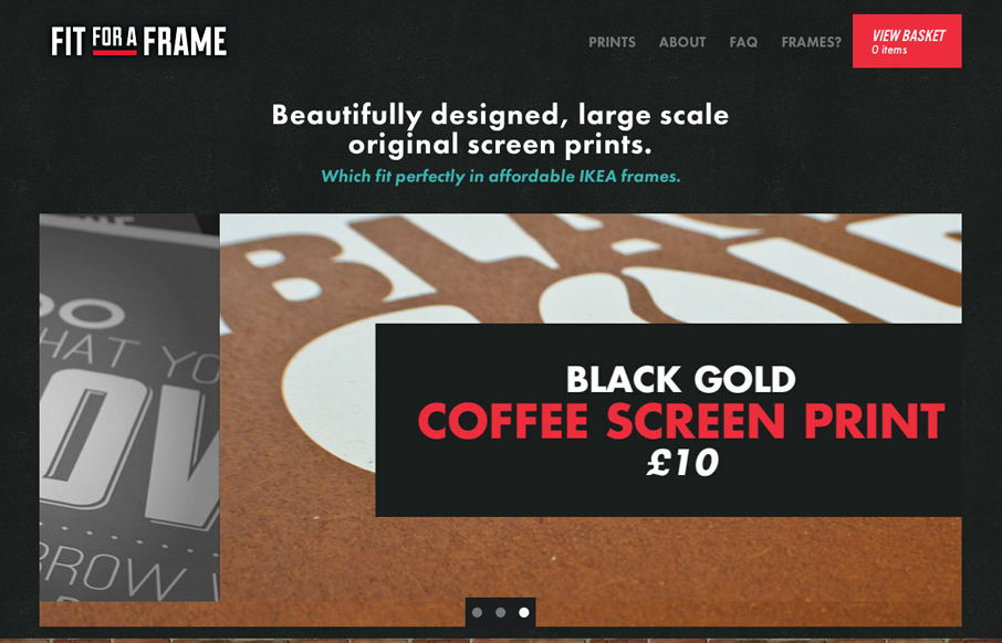
fitforaframe.com
Nice clean website for selling these oversized prints. I dig the blockiness of the design, it echoes the idea of the framed prints very well visually. There are some nice little details like the mouse over on the logo and the way the text of the print loads as you...
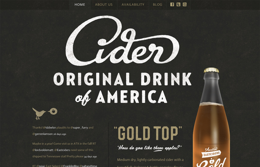
austineastciders.com
I love this site's mix of aged, textured fonts and simple structure. The combination of these two elements works really well with the photograph of the cider bottle. The golds and off whites work well with the black background, as well, though the text is a little too...
EMAIL NEWSLETTER
News & Articles
unmatchedstyle
Don't use Photoshop color profiles when saving JPGs for web use. http://bit.ly/rFBS5 (via @zeldman) #ums
unmatchedstyle
A note on testing methodology. Why testing CSS support in JavaScript is wrong. http://tinyurl.com/puglza (Via @ppk) #ums
unmatchedstyle
AudioBoo: @kingsloucher Quick review of slouchback.com, hope it helps you. #ums http://boo.fm/b22261

HARD WORK. CLEAN FUEL. NO EXCUSES
Use “WARRIOR2023″ for 10% off.