Web Design Inspiration Curated
Stash Icons
Cool looking interaction base on this site. I like the big focused areas for the different pieces of how the icons are sold and packaged. I also like the responsive approach here too. Very cool looking and the experience is memorable too.
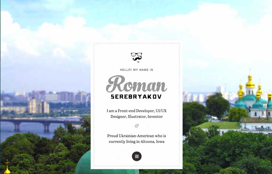
Roman Designs
Pretty cool interaction from the home page. I really like the original thought. Otherwise the design is super simple - half of it links elsewhere, which is also smart if you're truly active in those communities. Really smart design here.
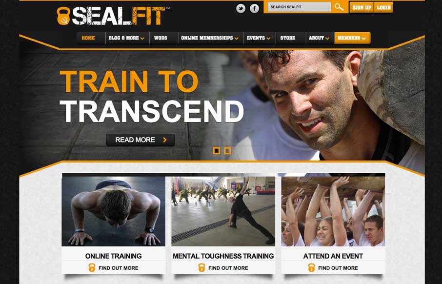
SEALFIT
Nice looking straight forward site. Covers all the basis and is quite loaded with content. Also it's something totally different than a portfolio website which is always nice to compare and contrast.
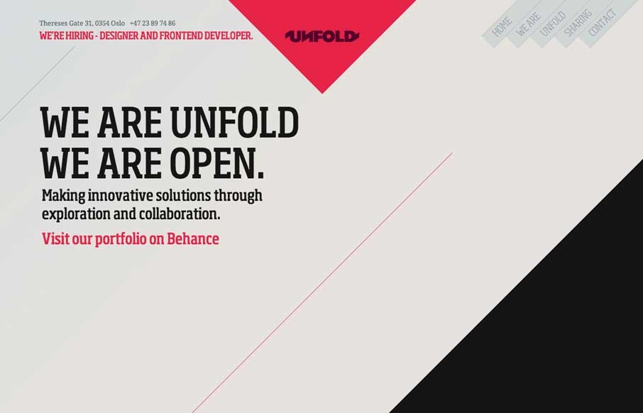
Unfold
Pretty cool layout, the angles make this website so different. I also dig how they change the navigation colors based on where you are on the page. Very interesting site design here.
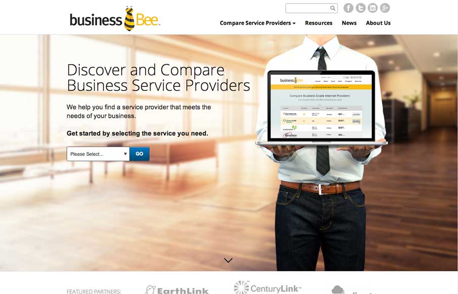
Business Bee
I like this design solely for how the laptop follows you down the page 🙂 It's fun and there's some other nifty interactive features on the page too. Very deep content wise.
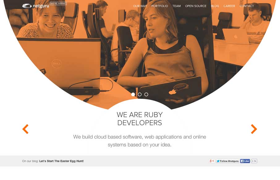
NetGuru
Pretty nifty site design, it's party blog like layout and part not. There's also some interesting interactive pieces like on the "our way" page, that keeps you interested in the content.
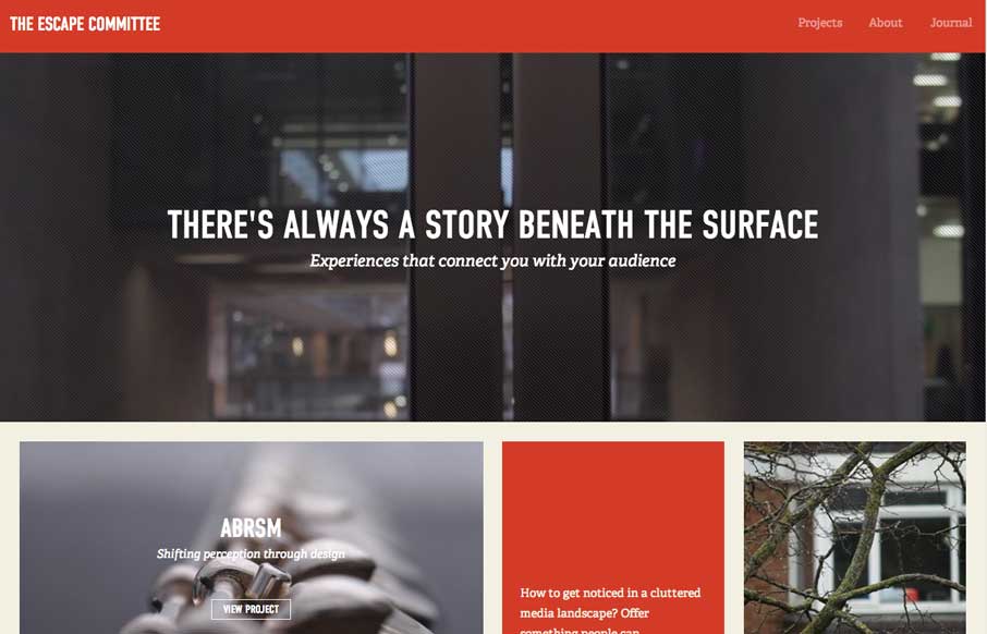
Escape Committee
Really cool layout for the Escape Committee website. I really dig the sharp lines and boxes the design is based on. The typography fits exactly how it feels like it should too. Makes me want to read all the articles.
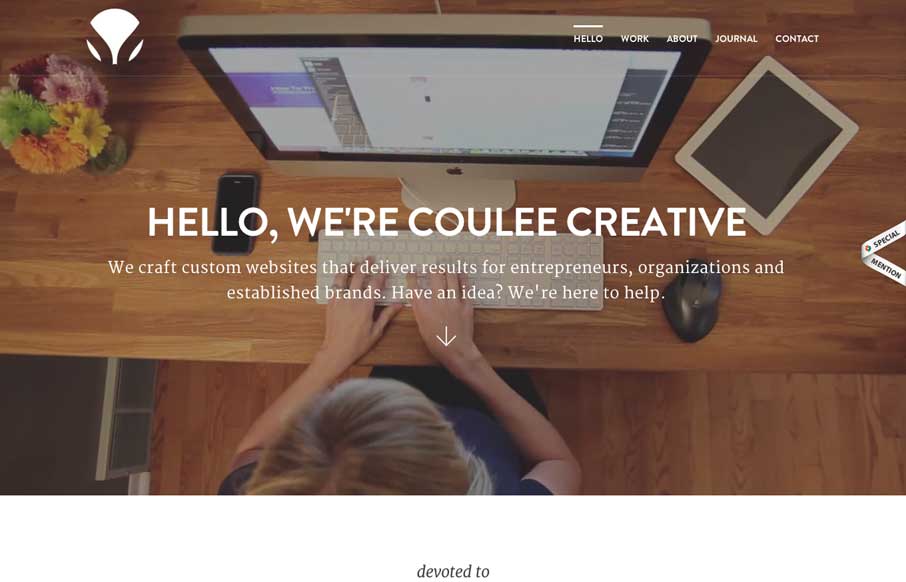
Coulee Creative
I feel like the Coulee Creative site uses what's become a fairly standard formula for a client services website layout. However, I like this one as an example of how to do it and keep it clean and interesting. This site is deep content wise and gives you enough info...
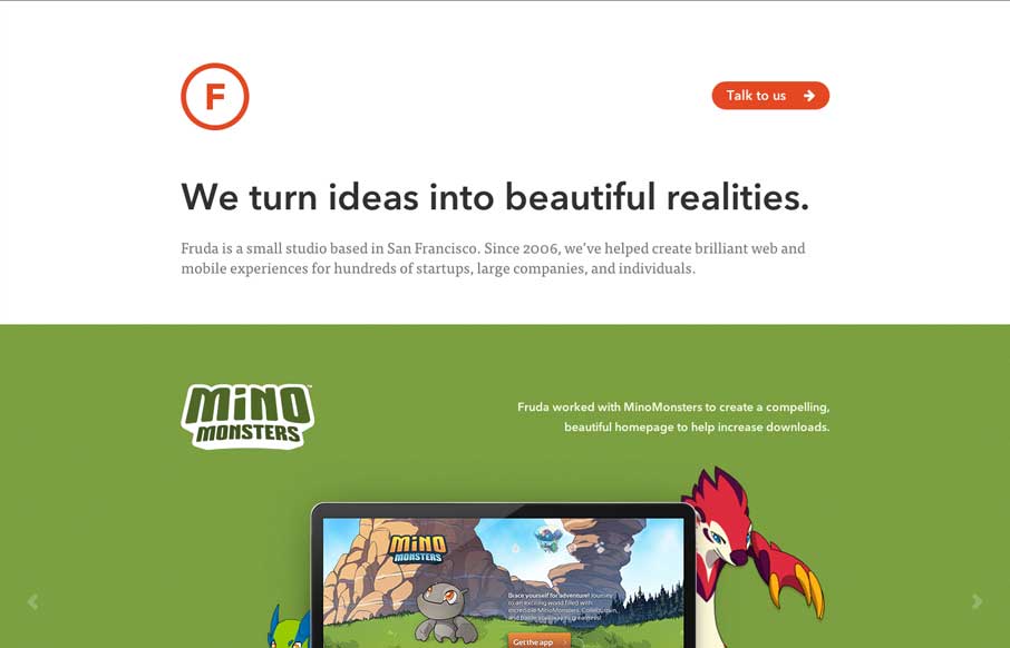
Fruda
Beautifully simple site. I love how the work is what it's all bout for Fruda. Single page and solid clean design close out the sale here.
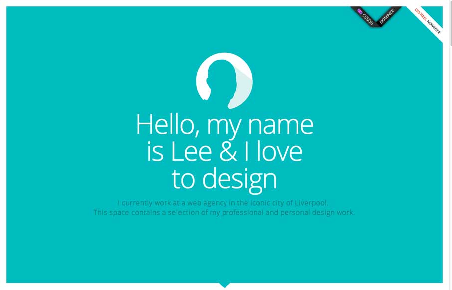
Lee Higgins
Nice clean layout with some interesting interaction; where the work samples slide into view as you scroll. I like the primary feeling color palette and how it's responsive. I'm not sure it holds up super well at the smaller screen widths but overall it's a nice design.
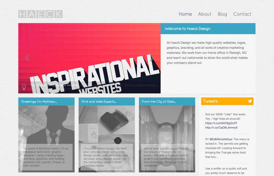
Haeck Design
Kind of a weird look for a web design company's site. It feels very much like a blog or news site. However I kind of like that, by focusing on the usefulness of the content it's putting the most important part first - the words. Debate it however you like; i'd love to...
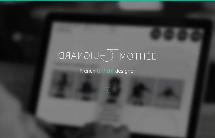
Tim Guignard
Pretty neat animations/interactions. I love how all the things slide into view in an almost surprising way as you scroll down. The multi use of the scroll and arrow keys is smart too. Also it's responsive.

Festival Intercult
Pretty clever use of loading animation effects as you scroll down this site for the first time. It helps take what is a pretty hard edged and clean design and give it some life. This kind of interactive feel is what gives stuff depth sometimes - you can take it too...
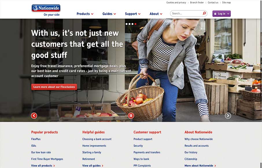
Nationwide.co.uk
In comparison to other major banking websites (in the UK at least) the recently re-designed Nationwide website is brave and modern. There's nothing particularly fancy about it which in a way is what you'd expect and want from a website such as this. It is however well...
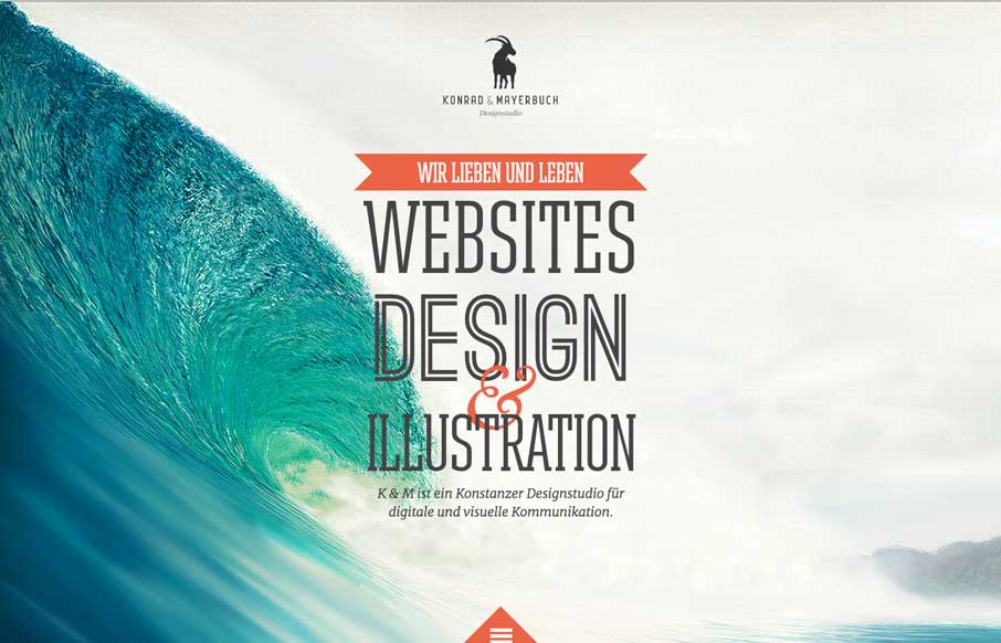
Konrad Mayerbuch
We get to see a lot of portfolio websites for designers and agencies from all over the globe here at UnmatchedStyle. Some of them can be convoluted, or too trendy. Konrad Mayerbuch's site is neither - it's clean, simple and if it has trendiness, then it's woven in...
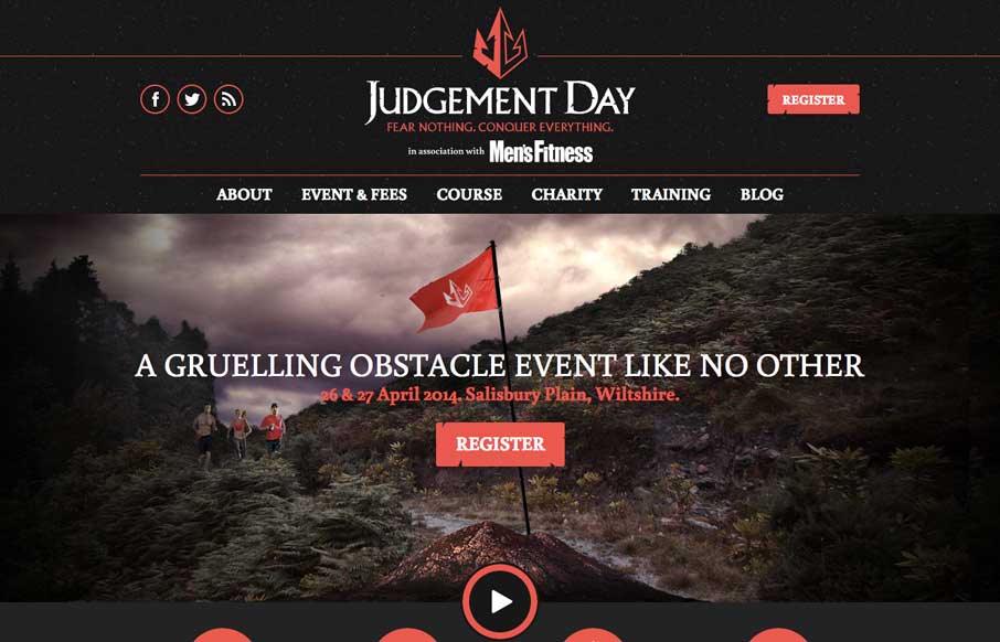
Judgement Day
Cool site that keeps it simple and is a straight forward layout. Proving good photography, content and solid layout work. Also this race looks fun.
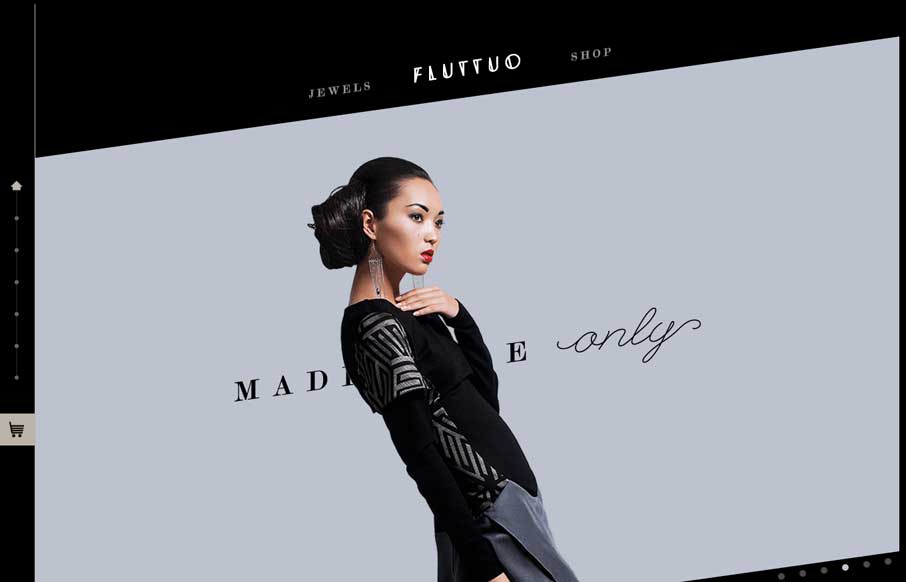
Fluttuo
Nice design that feels really different than what i'm used to seeing. The diagonal lines give it some real dynamism.
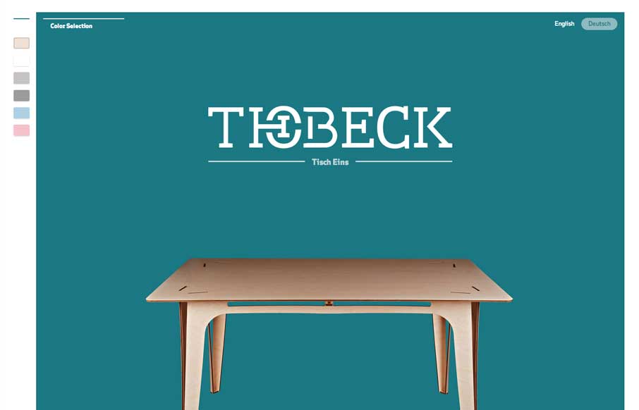
Thobeck
What a beautifully designed product site for this table. I love the way you interact and can change colors as you are looking at things. Also the way the product's story is told as you scroll is very well done.
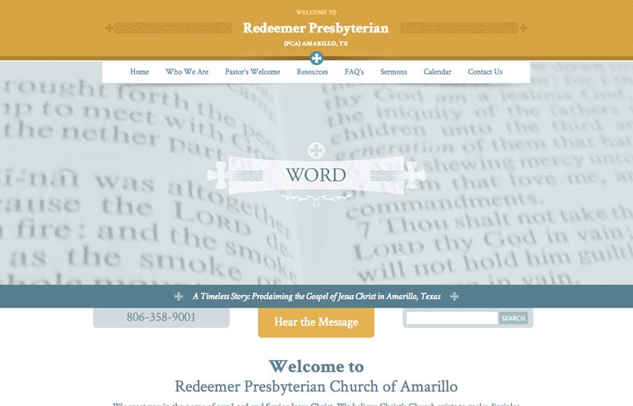
Redeemer Presbyterian
A nice easy going design for the Redeemer Presbyterian here. I'd love for it to be responsive but you can't always get what you want, eh? I do really dig the header area's design a great deal.
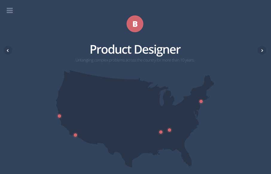
Bradley Haynes
Really, really great design for a portfolio site. I love the different pieces worked up for the slider/hero area. Brilliantly visualized and communicated stories. The rest of the site is simply wonderful and simple as well.
EMAIL NEWSLETTER
News & Articles
Jonathan LeBlanc: New Book & X.com
 Talking about his recent move to X.com and his new book Programming Social Applications.
Working with media queries and min-width
 Use a min-width approach in your Responsive Web Design/Media Queries for a more elegant solution.
UX & Accessibility 2011 Web Summits
 Check out the lineups for the UX & Accessibility online conferences & leave a comment to win tickets.

HARD WORK. CLEAN FUEL. NO EXCUSES
Use “WARRIOR2023″ for 10% off.