Pretty cool interactions to review on this site. First I like how the nav goes transparent when you scroll and reappears when you start to scroll back up. Then there are little movements on important buttons to show you where your attention to should be placed next. It’s not overly intrusive either. Great stuff here.


The Call to Action, Revisited
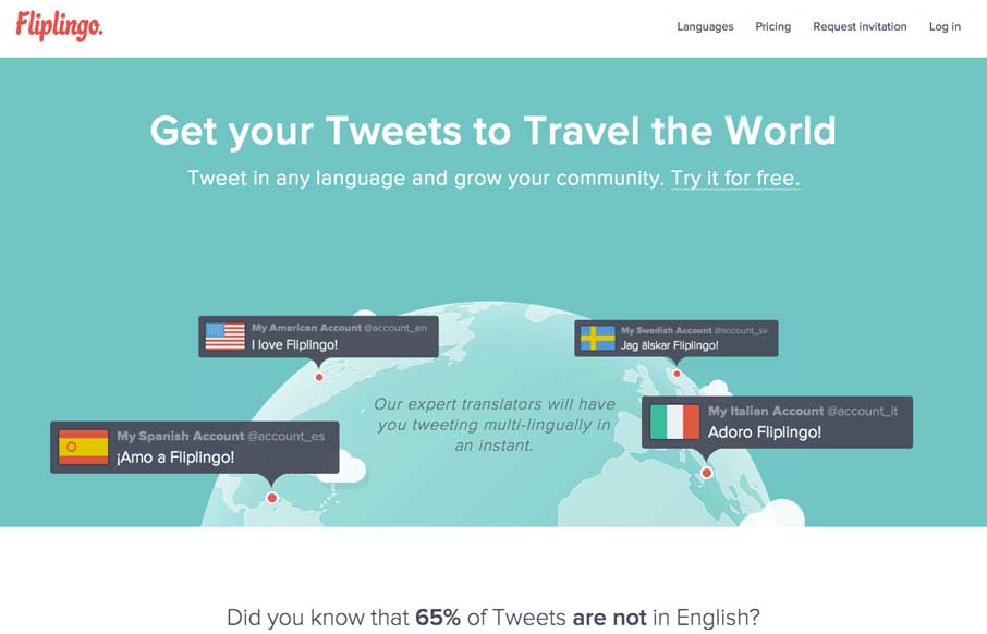
The Call to Action hasn’t changed in a decade, but the bar has. A fresh look at prominence, copy, mobile tap targets, and accessibility, with lessons from three major design systems.


0 Comments