Web Design Inspiration Curated
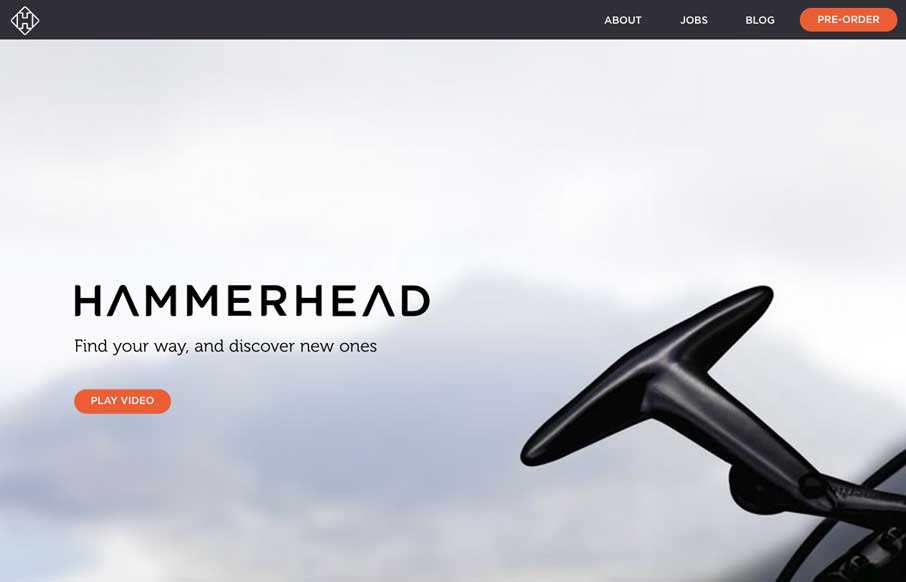
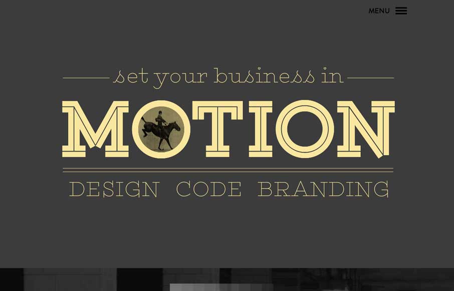
Hammerhead
I love narrative in a site design. This site is such a good narrative experience to scroll through. Well done.
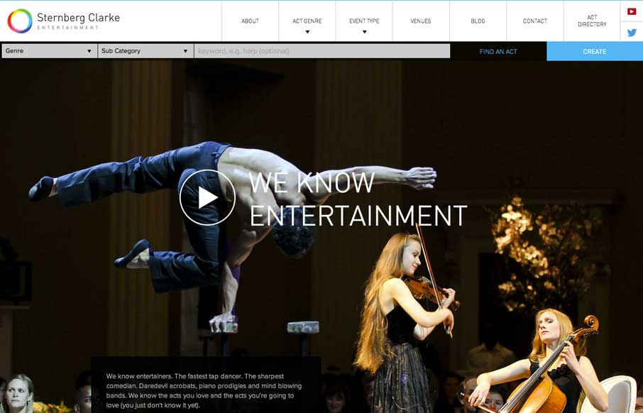
Sternberg Clarke
Well. The new responsive site for entertainment company @SternbergClarke is rather striking: http://t.co/WwJ2RMiAFc (via @leejamescasey) — Responsive Design (@RWD) May 7, 2014 One of the better fixed nav transforms i've seen. A quite nice layout as well...
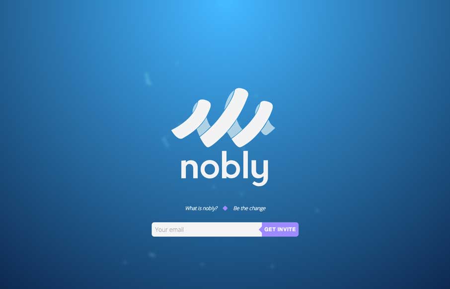
Nobly
We don't normally post splash pages or coming soon pages, but in this case. Dang, it's a neat one.
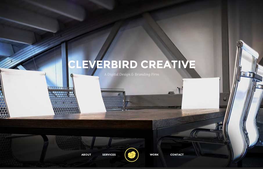
Clever Bird Creative
Really great transitions from space to space on the page make the Clever Bird Creative memorable for me. Also the use of slight transparent blocks of space also catches my attention. Beautiful stuff.
Anti Meridiem Design
Cool, almost subtle use of animations to draw your eye on the page. I like the slide out nav (not the hamburger icon use 🙂 but how they've used the big graphic blocks as marquee elements in the nav itself. Clever.
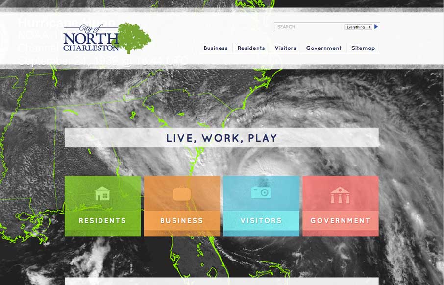
North Charleston
Nice layout here. I really like the detail work in how the page simplifies when you scale the browser down for the various screen sizes. Smart stuff. Also the detail in the search box ux. Check it out.
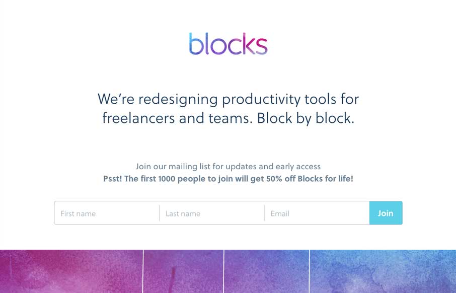
Blocks
We hosted ConvergeSE this year in the Columbia Museum of Art (CMA). It was cool as we were running around, getting everything set up, whizzing past 16th, and 17th century paintings, to just stop and stare at the art for a few minutes - connecting to the past. When I...
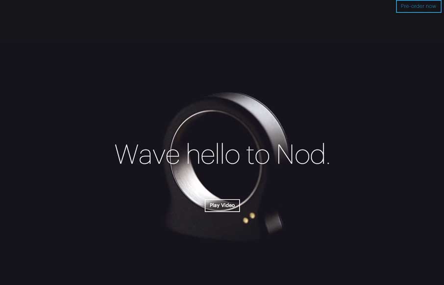
nod
A buddy of ours, Jonathan LeBlanc (@jcleblanc)from PayPal, did a presentation on the Rise of Wearable Technology for us this year during ConvergeSE. Nod (the product) would fit in well to that discussion. Nod's website is actually probably as impressive as the device...
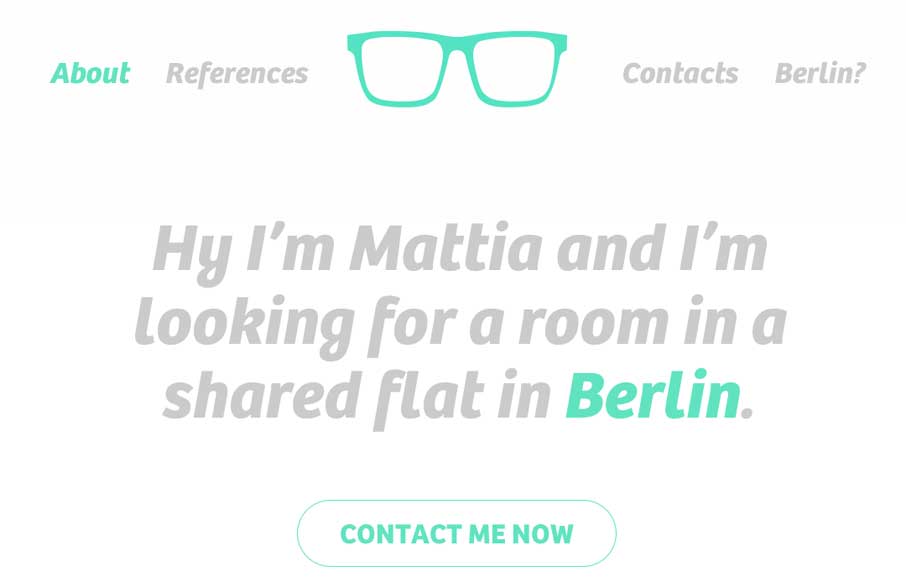
A room for Mattia
I admit that I'm still not sure why Mattia made this site... maybe to find a roommate in Berlin... but I like it because it's simple with a lot of white space. My favorite part is actually the form - not like normal ones, and really fits with the rest of the site.
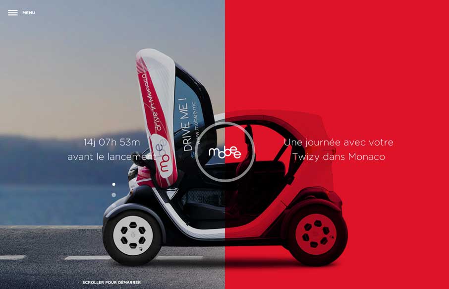
Mobee
I had fun with this site. Translate from French (if you want), and scroll down. The experience isn't overpowering, but it conveys the right mix of playful and cool - which is perfect when you're essentially selling a lifestyle service. Since it launches in June in...

Markt
iOS app product pages can be very over-done. Markt has a very simplistic style that doesn't flood you with whiz-bang features of a website, that might detract from the whiz-bang features of the application itself (which is what you're selling, so shouldn't be the...
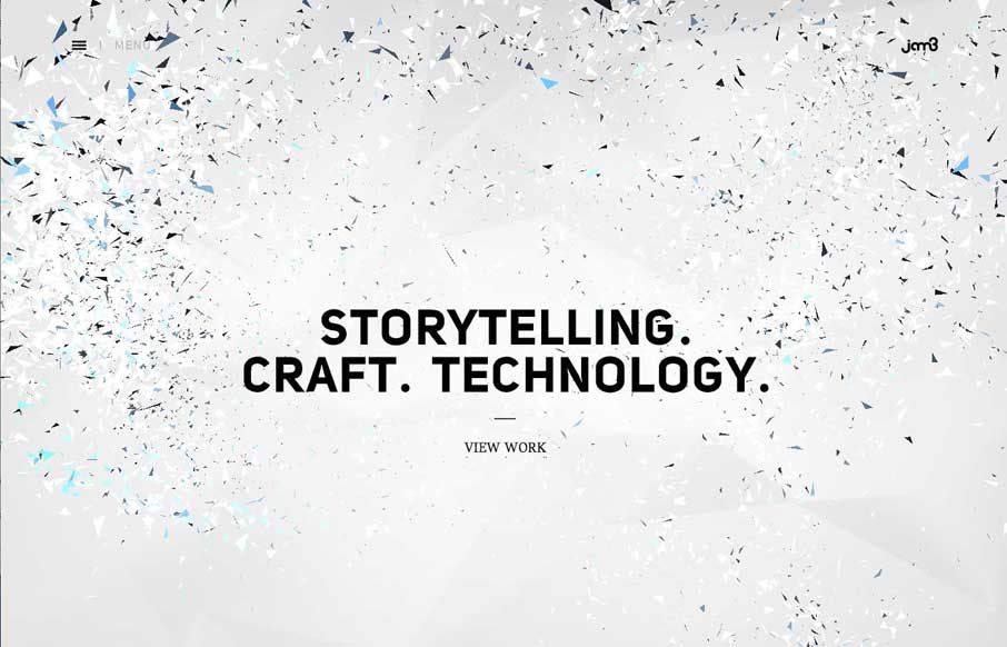
Jam3
Maybe it's my ADD, but it took me a while to get off of Jam3's home page. I dare you to move your cursor around the page and through the copy. I've seen a similar this a couple of weeks ago when I was doing research for Radar...
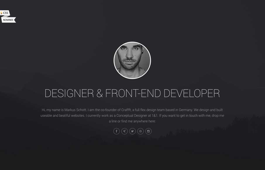
Markus Schott
Pretty fun layout for Markus Schott's page. I like the life stats and graphs section. Gotta work on those dance skills though dude. 🙂
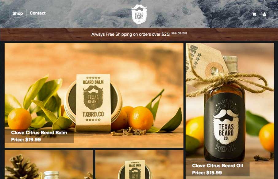
Texas Beard Company
Very nice, very simple site design. Good photos and a super awesome brand. I just smiled checking this site out.
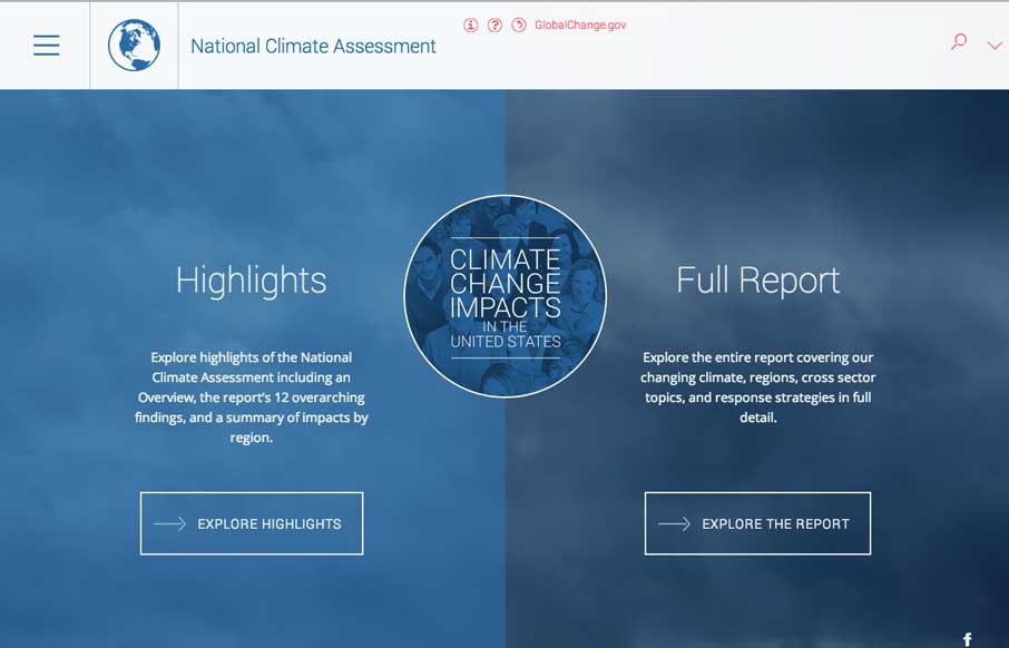
National Climate Assessment
Aside from being scared now. The National Climate Assessment website is a thing of beauty. Fully responsive and pretty dang immersive. Beautifully executed.
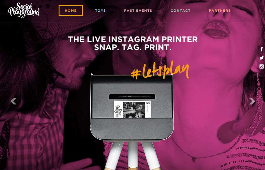
Social Playground
Leave it to the Aussies! Said with love for a group of people that I got to spend a year with so many years ago. From experience, I can tell you that they love to have a good time! This site further accentuates that fact. I first like the concept of bringing the...
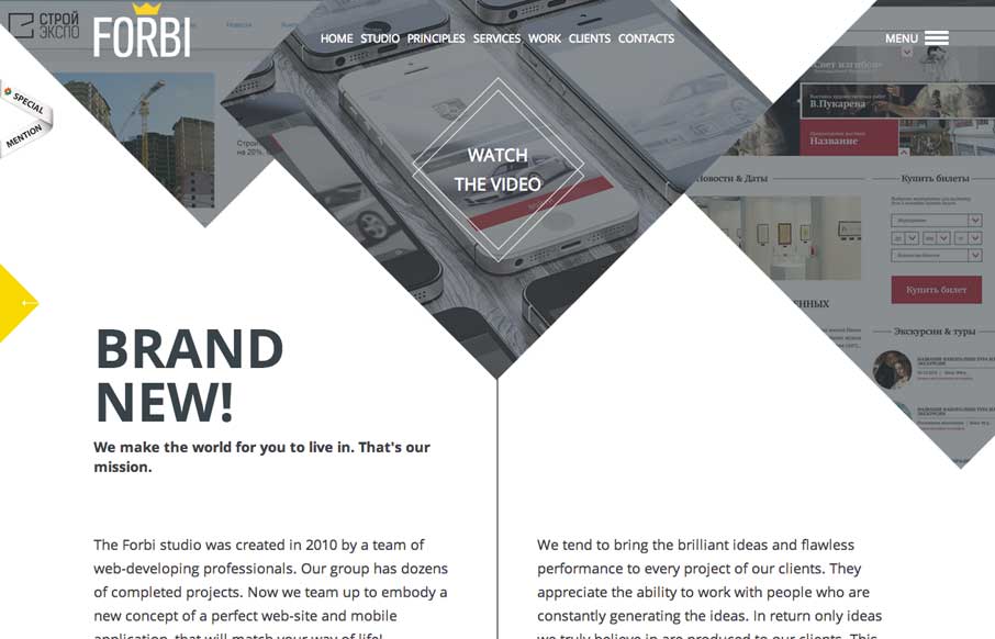
Forbi
I really like the unconventional way Forbi has their "big pictures" at the top of the site. What follows is very simple and clean, with abstract line drawings as accents, that don't detract from the content. There are just enough fade ins to give the site some life,...
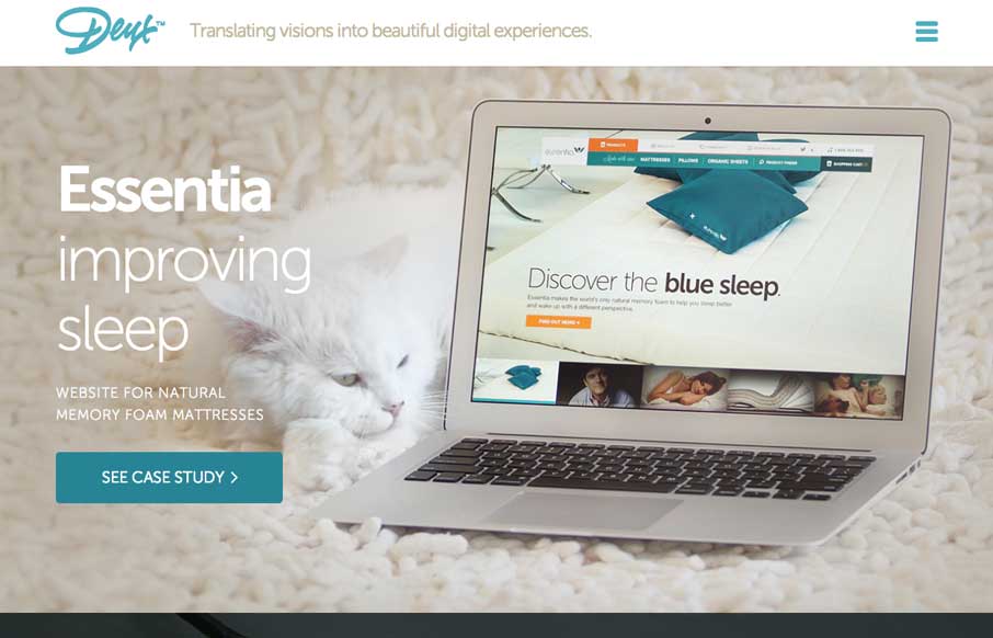
Deux
Wow. We were talking to a client yesterday about how they wanted to present images on their website in a way that will wow people, and make them want to read more / interact with the site. Deux's website does that for me. I actually wanted to click on and see their...
Code & Theory
What a beautifully thought out and executed experience the Code & Theory website is. I spent at least 15 minutes just clicking through and scrolling around this site.
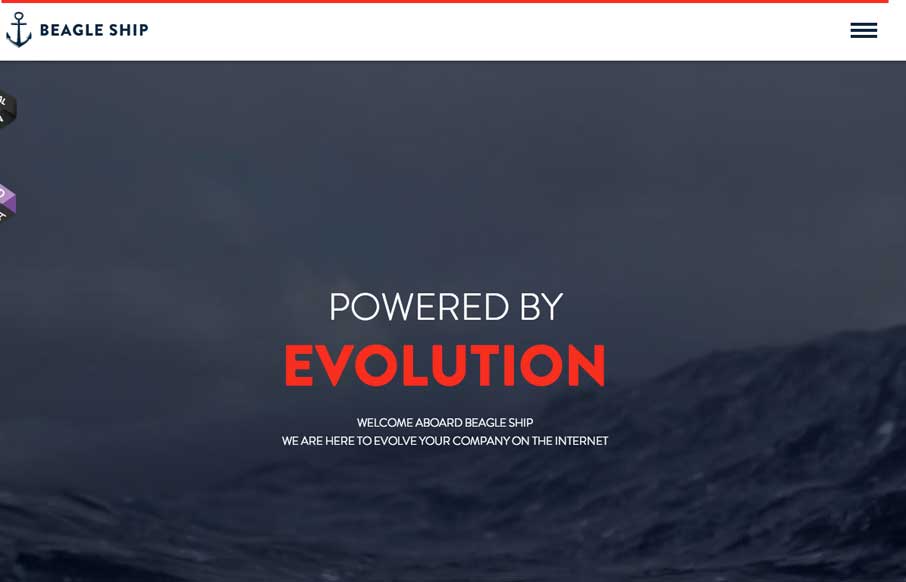
Beagle Ship
Cool interactions and content blocking. I really dig the first time experience when you hit this site. The way the portfolio navigation on the home page is designed is very cool along with the loading animations of the 3 marquee sections.
EMAIL NEWSLETTER
News & Articles
Book Review: The Manual
 Audio Review and quick discussion of several things in The Manual
Aaron Irizarry
 Interview with Aaron who brings the awesome every day!
Jonah Goldstein: SophieHardach.com
![]() Discussing the .Net awards site of the year nomination for Jonah’s website he created for Sophie Hardach.
Discussing the .Net awards site of the year nomination for Jonah’s website he created for Sophie Hardach.

HARD WORK. CLEAN FUEL. NO EXCUSES
Use “WARRIOR2023″ for 10% off.