Web Design Inspiration Curated
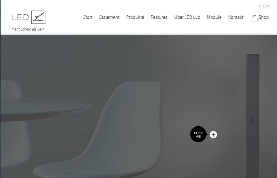
LED Luc
LED Luc does a good job of showing off their products in an aesthetically pleasing way - that mirrors their aesthetically pleasing lighting products. I try not to translate pages into English at first, to see if I get what the website is trying to relay or sell me on...
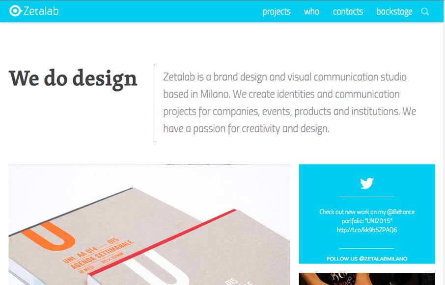
Zetalab
Zetalab is a clean and vibrant site showcasing this Italian / Brazilian agency's work. We just worked on a site that had a similar interaction as the Projects page, and like how they did their tagging, but also included the infinite scroll (but definitely glad they...
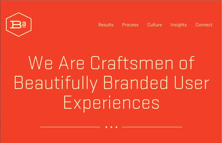
Brand Aid
We'll be in Nashville for BDConf in a couple of weeks, and I hope we run into these folks from Brand Aid Design. Their site proves that you can do don't have to have all the bells and whistles on a site to make it effective. It's simple and clean - and any whistles...
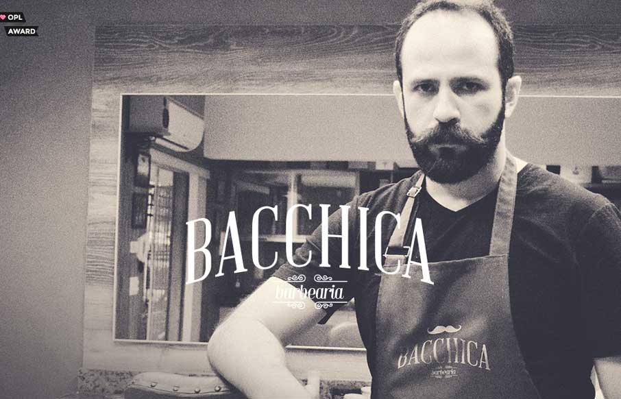
Bacchica
Today is taking on a distinctly Brazilian theme with reviews (unintentionally - even though the World Cup ends this weekend). I do not pretend to speak this language, the language that permeates our industry, the language of beards... but I can appreciate a good...
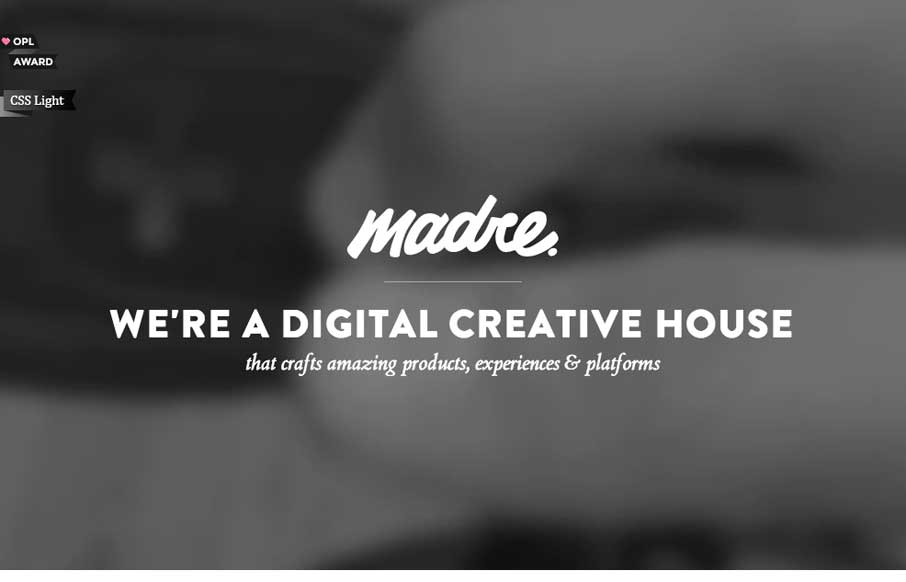
Madre Crossmedia
Let's start Thursday with a good one - Madre Crossmedia. It's very simple, but has some different interactions than most agency sites. The copy and the form are subtly animated as it comes in on scrolling. The links to the portfolio give you a hint of what Madre is...
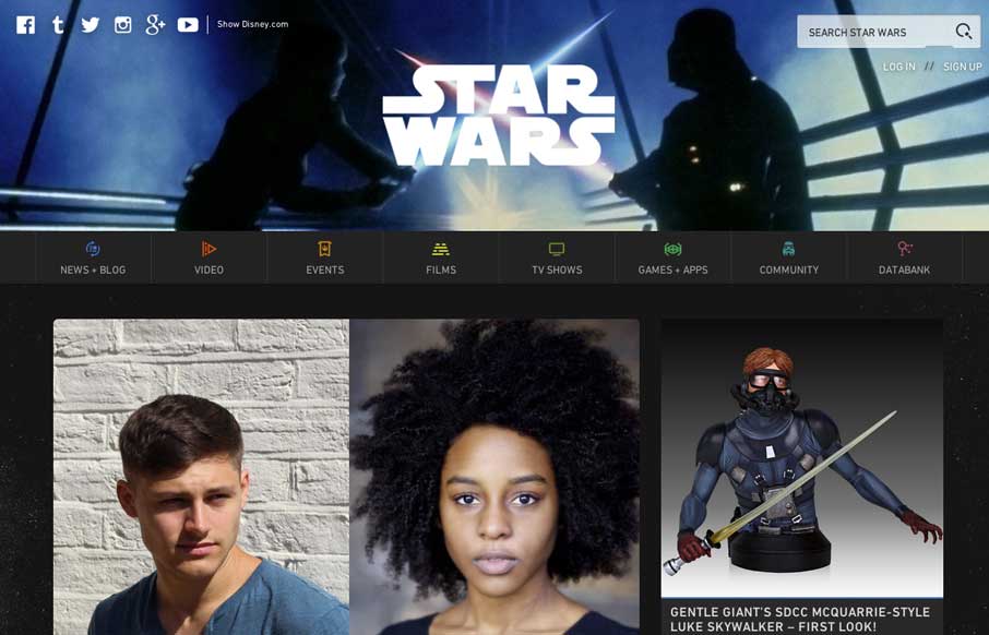
Star Wars
Have we reviewed Star Wars before? Who cares - let's do it again! (After all, it's not May the 4th, but it is 2:30 on Wednesday - and, duh, it's Star Wars....) I could spend a couple of days on this site because of all the nerdy goodness (especially clicking through...
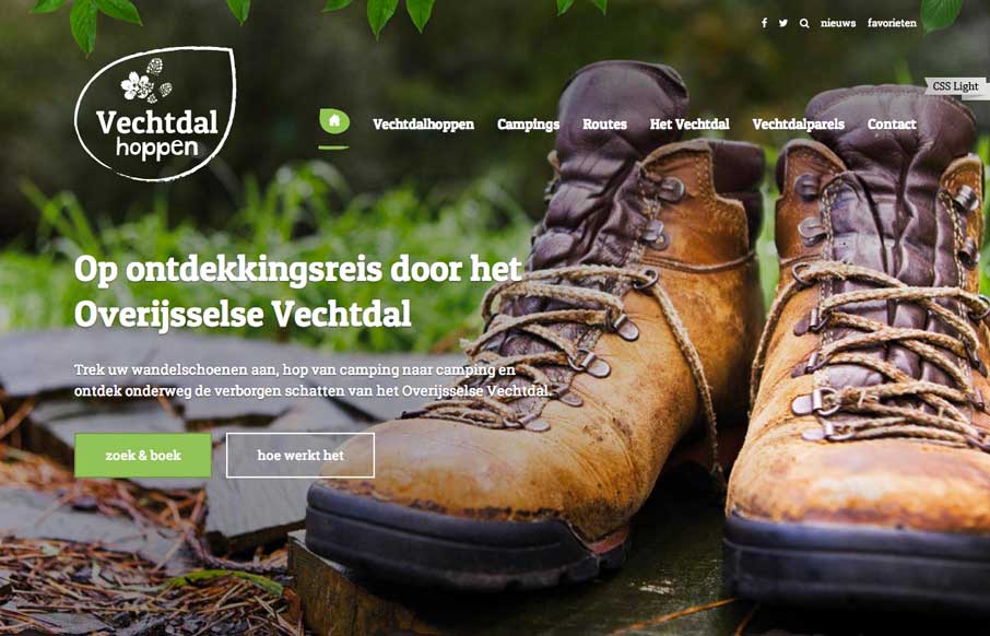
Vechtdal Hoppen
Really like the big background image to start out the site - hiking boots may not be your thing, but sets the tone for the rest of the site. It's a good showcase of the campsites / experience they have to offer. And I don't know what is going on in this picture - but...
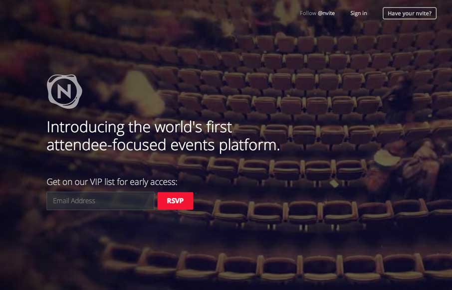
nvite
We put on a lot of events throughout the year, whether through Unmatchedstyle, with our Converge, BDConf and other conference series - or here locally in the co-work we started last year - so we're always interested in new event management apps / software - anything...
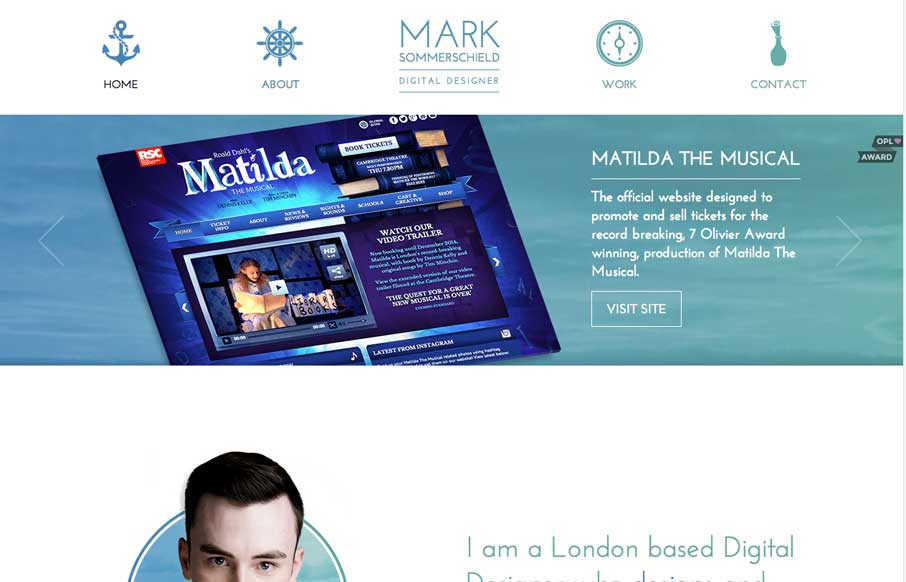
Mark Sommerschield
My kids are listening to Roald Dahl's Matilda right now, so Mark's website caught my eye (since one of his portfolio pieces is for the musical of Matilda). Mark's site is clever and well constructed with a cool sea theme, animated SVGs and hints of parallax - all of...
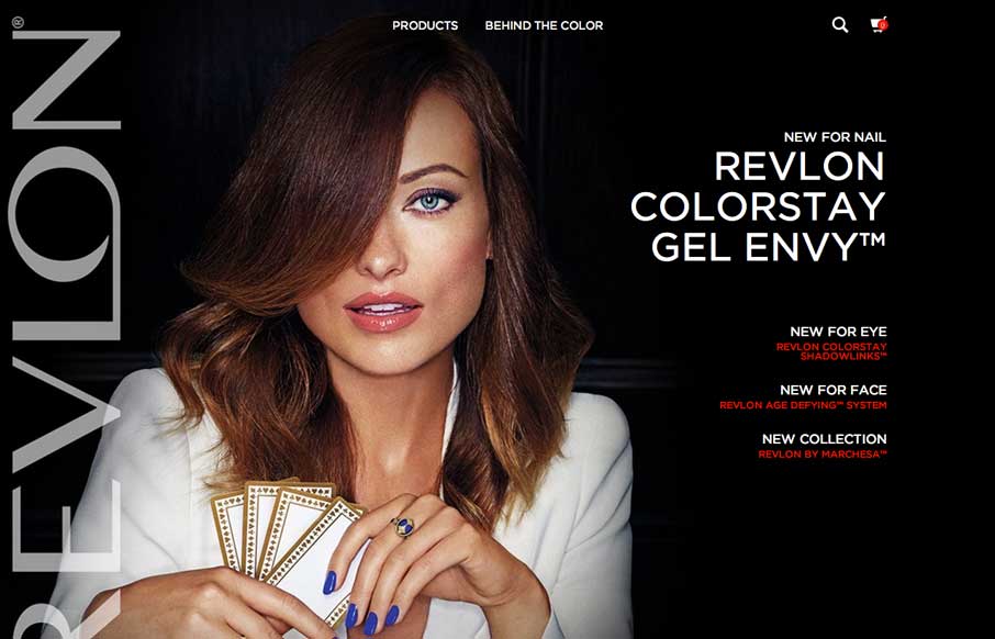
Revlon
So - how do you get your website to mirror your long established, beautify and elegant print campaigns - ask Revlon. The home page of the site looks like a magazine cover, something to draw you in with a big picture, but let's you know that there is more inside. The...
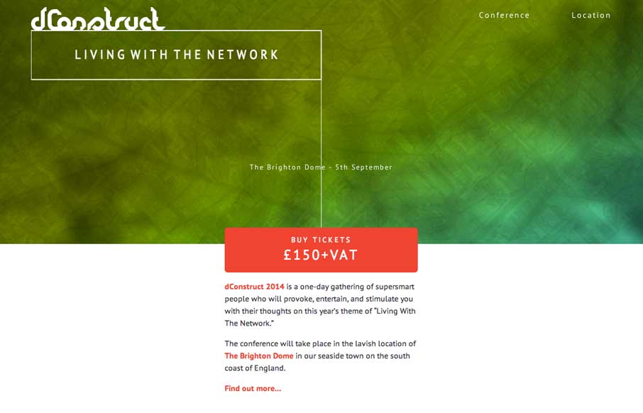
dConstruct 2014
Cool and simple site on the surface, but we know from experience that getting simple down can be hard. We're seeing more of the canvas / css / svg animations that respond to your input, and this is a nice, light use of it just to get your attention, but not detract...
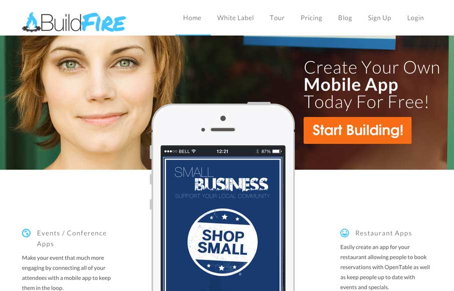
Buildfire
Nice bold graphics on the Buildfire website. I like the large iPhone graphic that shows off an app. The slight parallax effects behind the main section headers are nicely done too.
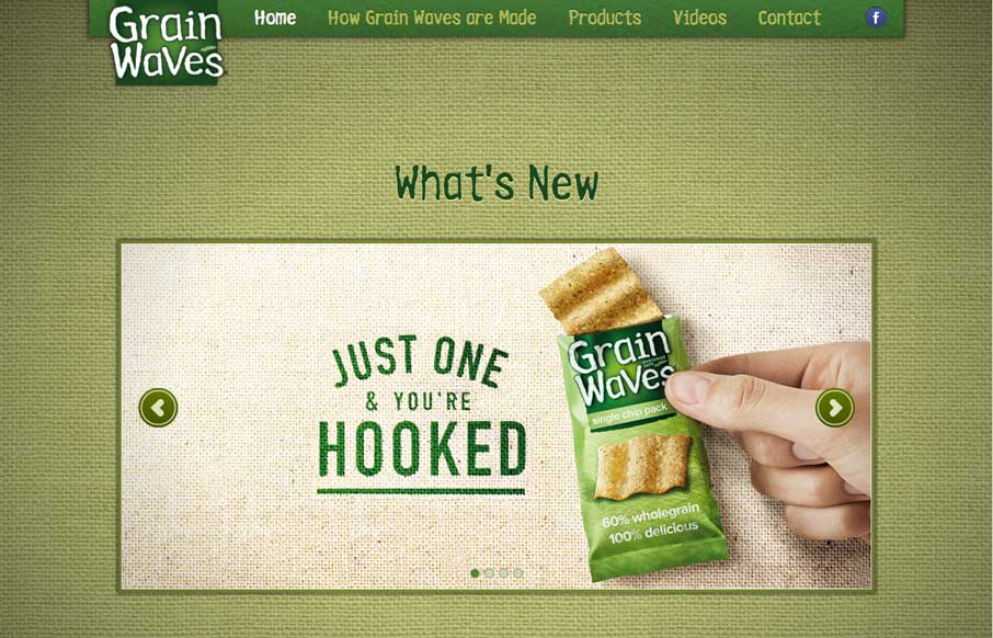
Grainwaves
Nice interaction here where the site scrolls up as you click through the navigation. It's unexpected and entertaining.
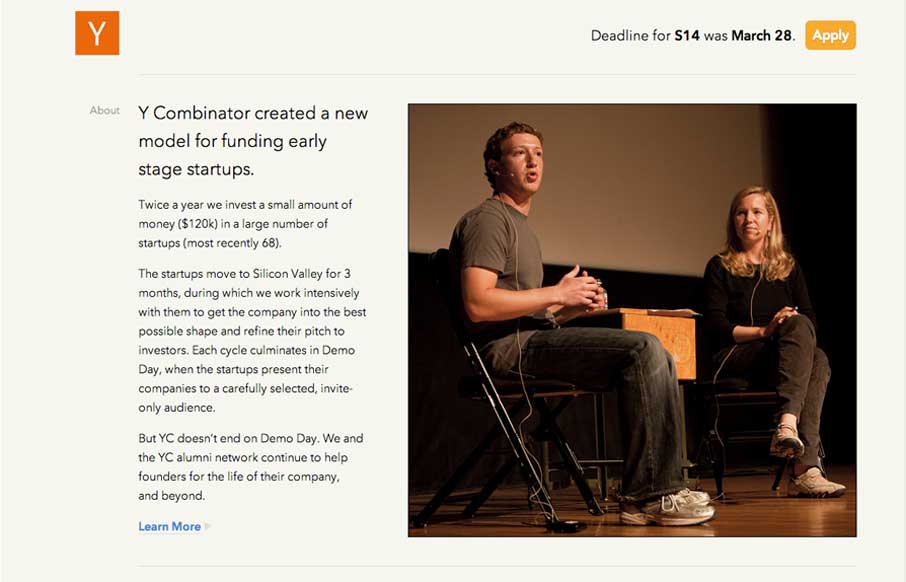
Y Combinator
New design for the Y Combinator site. It's a nice clean design that's slightly asymmetrical which I like. I also like how the navigation is played down on the site, it's at the bottom. The focus is more on the first level content like the startup programs and the news...
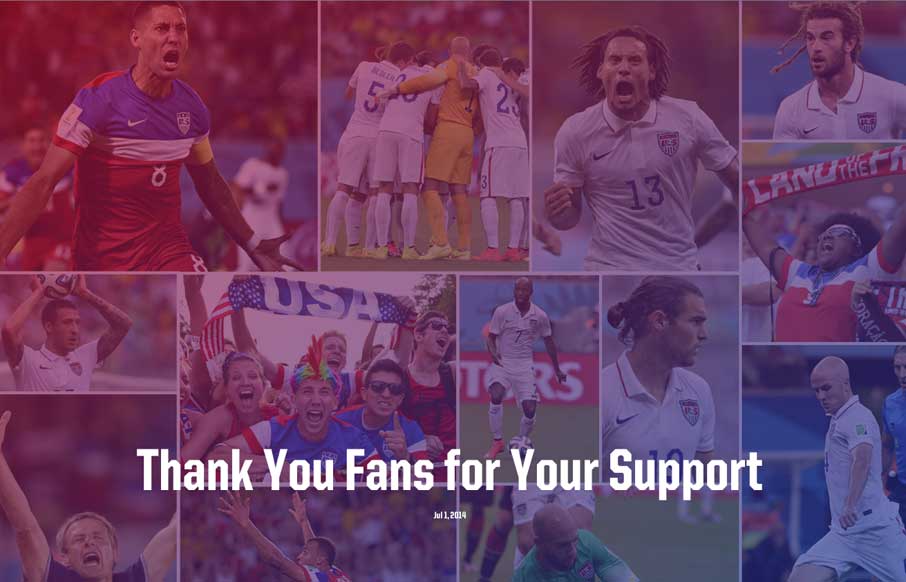
US Soccer
Yes - I was hoping to write this review with a smile that was 8ft high x 24ft wide... but alas, that was not to happen. Either way, it is great to see interest in US soccer continues to grow as we start to catch up (yes... little by little) in a sport that is not even...
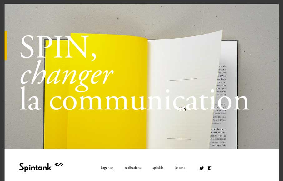
spintank.fr
With as many website submissions as we get, I admit that we have to look at some of them twice to see the clever, little things that make a site worthy of posting in the gallery. Spintank's site was one of them for me. I think I was thrown off initially by not...
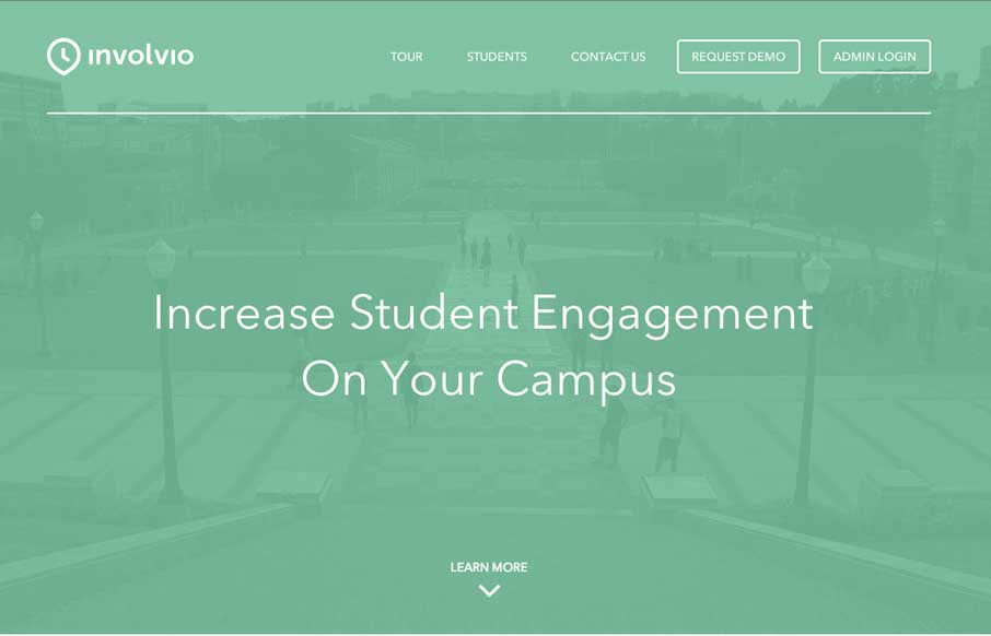
Involvio
Involvio has a pretty cool little site. As we see video backgrounds come into play, they are either overt or muted - and I keep thinking that the muted, with added text, plays better to market your website. The rest of the site is clean, with good app-selling images,...
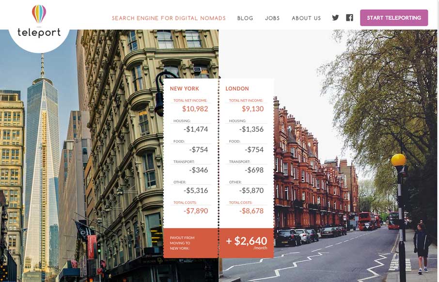
Teleport
Some of our dear friends we met while living in Australia have just moved from Seattle to Singapore this month. Looking at Teleport's website (for more than just the design quality), this is a service that will begin to get useful for digital expats, if they execute...
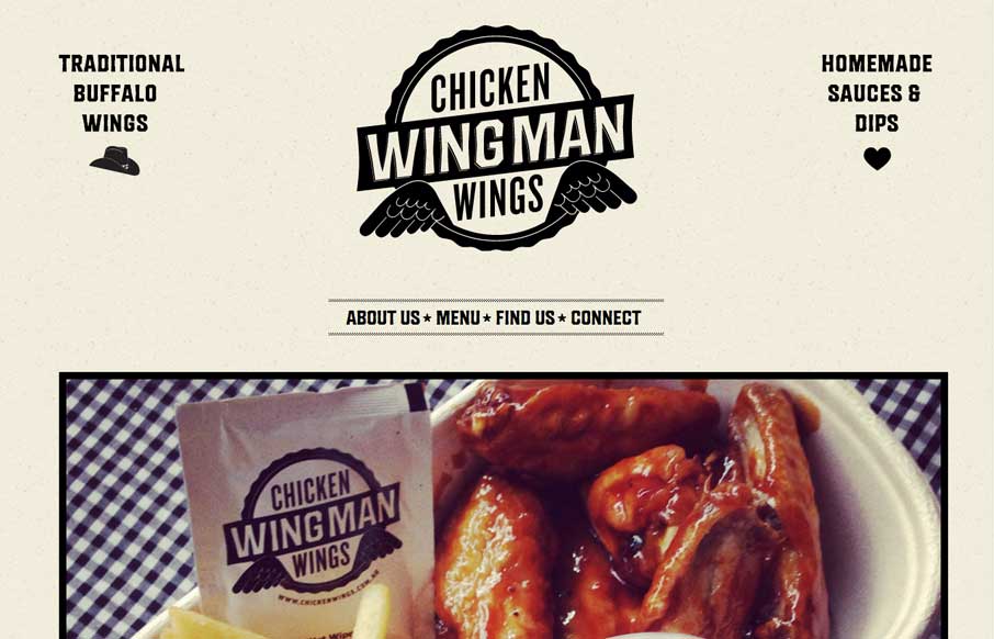
Wingman Chicken Wings
I only made it to Melbourne once (briefly) when I lived in Australia - and if Wingman was around then, I probably would have moved there. I do have a love for most things Aussie, from Rubgy (all three versions), to seacoast living, to the bats that live in the Royal...

netdreams.co.uk
Awesome use of a subtle parallax slider that fills above the fold. Also, check out the detail pages for the portfolio work - good navigation, and great, clean way of displaying their work.
EMAIL NEWSLETTER
News & Articles
CSSOff Winners 2012
 Grand Prize and top 25 Winners announced.
CSSOff Update #6
 Update number 6, announcing the winner on Feb 29, rain or shine!
Chat Session: Yaron Schoen
 Talking with Yaron Schoen about his design career, freelancing and opinions on design vs. code.

HARD WORK. CLEAN FUEL. NO EXCUSES
Use “WARRIOR2023″ for 10% off.