youandigraphics.com

youandigraphicscom

Submitted by: Irene Demetri (@youandigraphics)
Role: Designer & Developer

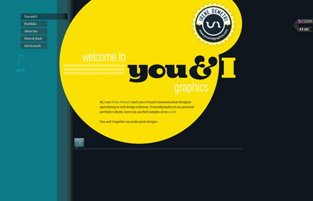
I like the strong striking yellow against the dark background on the main “home page”. The fixed navigation design makes it stand out well as the page scrolls down, especially the way it extends to mark that your currently viewing the section that’s denoted by the navigation element. Seems simple but i’m constantly surprised by the single page scroller designs out there that don’t do that very well.

0 Comments

Submit a Comment

Your email address will not be published. Required fields are marked *

Time limit exceeded. Please complete the captcha once again.

News & Articles

Website Scanning Patterns for Maximum Engagement

Website Scanning Patterns for Maximum Engagement

Discover how users visually process websites, the role of scanning patterns, content placement, and “the fold” Learn to design engaging pages with fast-to-consume content that aligns with user behavior.