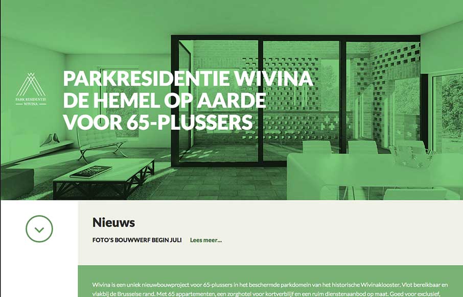
I like how the website feels like it slides into place over the big header “hero” image area, then looks like a standard style left column nav based design. That’s a cool effect that’s really just about positioning the page elements smartly.
Glassmorphism: The Transparent Design Trend That Refuses to Fade
Glassmorphism brings transparency, depth, and light back into modern UI. Learn how this “frosted glass” design trend enhances hierarchy, focus, and atmosphere, plus how to implement it in CSS responsibly.


0 Comments