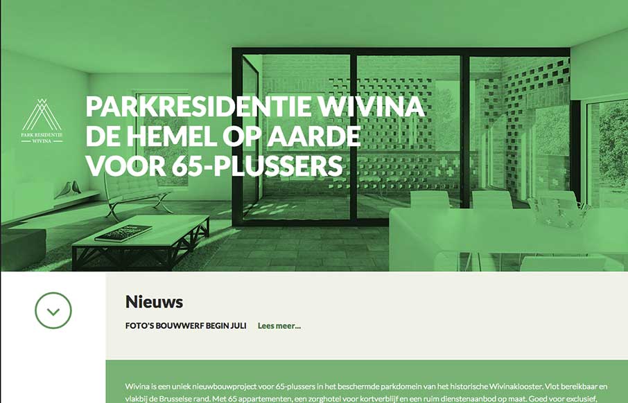
I like how the website feels like it slides into place over the big header “hero” image area, then looks like a standard style left column nav based design. That’s a cool effect that’s really just about positioning the page elements smartly.
Beyond the Basics: Unlocking the Real Power of CSS Pseudo-Classes
Unlock the full potential of CSS pseudo-classes. Go beyond :hover and explore powerful, modern techniques that reduce code bloat, enhance accessibility, and replace JavaScript with smarter, scalable styling.


0 Comments