Wingmen Ltd

https://wingmen.fi/

I’m really starting to get into sites that use their home page as their main navigation (maybe it’s because we did that with our new ConvergeSE site).

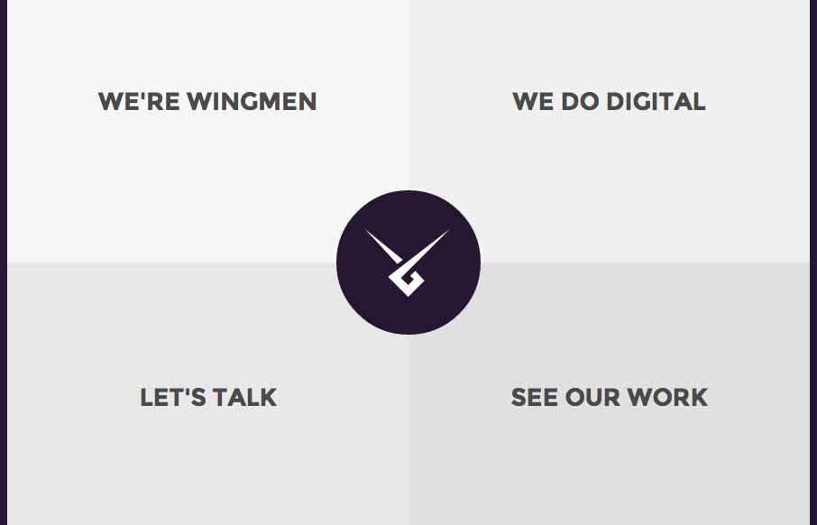
I like Wingmen’s site  (out of Helsinki, Finland) because it’s simple, direct, uses that home page as nav, but also finds a good, quick way to get you back to the nav / or next section when you’re done reading the “page” you’re on. The fact that the way back to the nav changes from corner to corner, might be a little confusing, but the animation of the circle, to quarter circle should clue a user into that “click here” moment – let me know what you think.

From the Designer: Simple and elegant web agency website design.

Submitted by: Jussi Kaijalainen

Role: Designer & Developer

Twitter @wingmenltd

0 Comments

Submit a Comment

Your email address will not be published. Required fields are marked *

News & Articles

Sign-Up: Enhancing Conversions through good UX

Sign-Up: Enhancing Conversions through good UX

Optimize your website’s sign-up process by focusing on clarity, ease, and user mindset. Clearly explain the purpose, benefits, and steps, and use social proof to build trust and drive conversions.

The Essential Guide to Getting Started on Freelance Writing

The Essential Guide to Getting Started on Freelance Writing

Explore the lucrative and fulfilling world of freelance writing with our essential guide. Learn about specialties like blogging, social media, article, and technical writing. Build a portfolio, find work, set up your business, and discover the potential earnings. Embrace the freedom of working from home and follow tips for success in your dream career.