
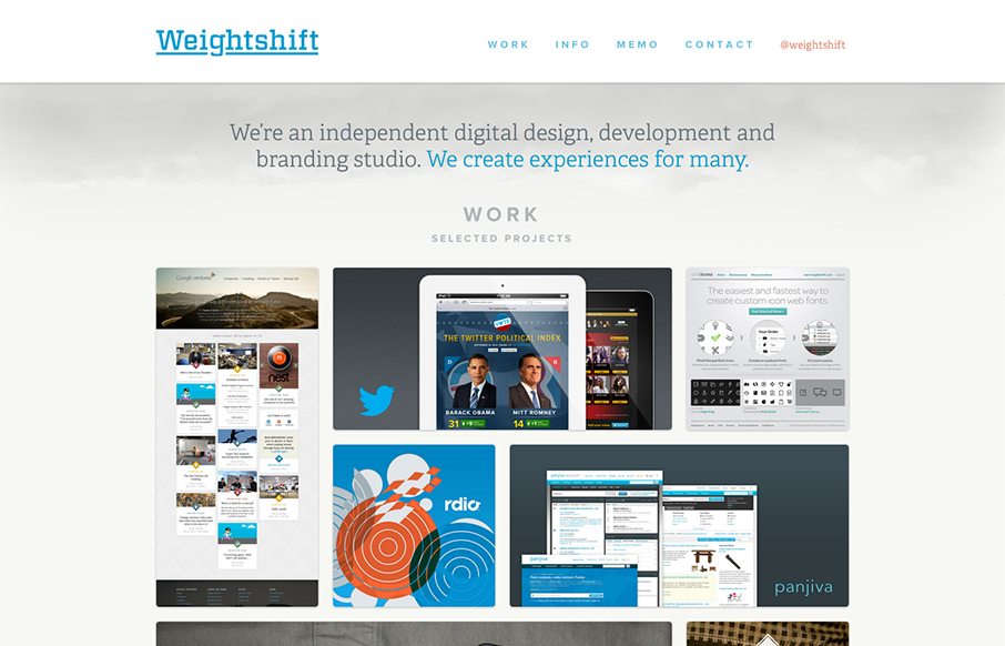
Superb responsive design decisions made on this newest version of Weightshift’s site. Making the portfolio images get smaller and more button like for the iPad and iPhone screen widths is brilliant. I also think the focus on the selective nav elements as you get smaller in screen width works great too. Going down to “work, info & memo” makes it so well focused and clear. Love this website!


Fitts’s Law: Why the Easy Button Wins
Large, close targets are faster to hit than small, distant ones, that’s Fitts’s Law. A look at the 1954 rule behind buttons, prime and magic pixels, thumb zones, and dark patterns.


Nice effect and work.
Thumb up!!!