WEI SRAUM

http://weissraum.at/

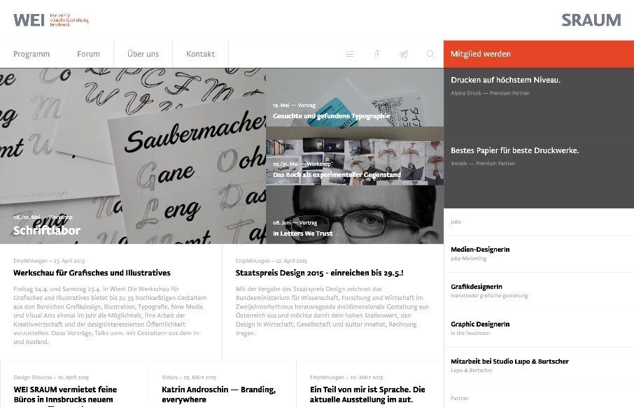
There is a lot going on here to get this website responsive visually. The grid is pretty core to its layout and it flows really well from screen to screen width. I also really dig how the header/nav stays fixed and moves up visually as you scroll down.

From the Designer: “WEI SRAUM is an initiative for better graphical and visual understanding in Tyrol, Austria. We host Lectures, Workshop and other events.
WEI SRAUM is the german word for white-space, where our typographical roots come from. The website is built with Ruby on Rails and has its own backend for the management of not only the Website but the entire association.”


Submitted by: @florianmatthias
florianmatthias.com


@WEI_SRAUM

0 Comments

Submit a Comment

Your email address will not be published. Required fields are marked *

News & Articles

Sign-Up: Enhancing Conversions through good UX

Sign-Up: Enhancing Conversions through good UX

Optimize your website’s sign-up process by focusing on clarity, ease, and user mindset. Clearly explain the purpose, benefits, and steps, and use social proof to build trust and drive conversions.

The Essential Guide to Getting Started on Freelance Writing

The Essential Guide to Getting Started on Freelance Writing

Explore the lucrative and fulfilling world of freelance writing with our essential guide. Learn about specialties like blogging, social media, article, and technical writing. Build a portfolio, find work, set up your business, and discover the potential earnings. Embrace the freedom of working from home and follow tips for success in your dream career.