Submitted by: Kathie @zhngdesign
Role: Designer & Developer
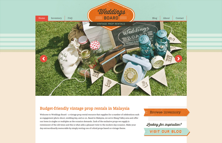
Interesting business here, vintage prop rentals for photo shoots and whatnot. With a subject like that how do you make a website that ‘feels’ vintage, but is still a usable website. They’ve done it with colors and lines really. Putting the layout in the shape of a large box like this gives it that tight worked over feel that most ‘vintage’ designed items have. There are some more modern conveniences here too, like a responsive design. Check how the logo smoothly changes size as you refix the browser window.


0 Comments