
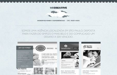
NIce single page layout, I love the soft colors and texture. There’s a lot packed into this one page too. I like how the work samples are displayed with the large image using a slideshow then smaller samples in a grid patter next to it. I think some of the body text is hard to read it’s just a bit too soft a gray on top of that light blue, then some of the mouse over colors make it harder to read. Overall though I think the site is well done and works well for it’s purpose. My favorite part is the form in the footer of the page.




0 Comments