wecreative.com.br

wecreativecombr

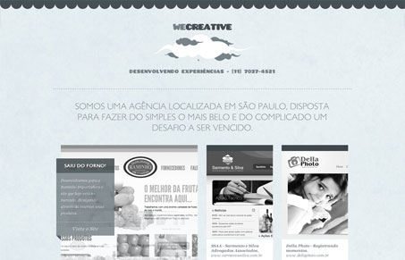
NIce single page layout, I love the soft colors and texture. There’s a lot packed into this one page too. I like how the work samples are displayed with the large image using a slideshow then smaller samples in a grid patter next to it. I think some of the body text is hard to read it’s just a bit too soft a gray on top of that light blue, then some of the mouse over colors make it harder to read. Overall though I think the site is well done and works well for it’s purpose. My favorite part is the form in the footer of the page.

0 Comments

Submit a Comment

Your email address will not be published. Required fields are marked *

News & Articles

Looking Fast: The Art of Website Speed Perception

Looking Fast: The Art of Website Speed Perception

In the web world, technical speed and user perception matter. By improving design for a faster appearance, you boost conversions and stand out online. Speed isn’t just loading time; it’s perception.

Designing for Errors: Creating User-Friendly Contingency Plans

Designing for Errors: Creating User-Friendly Contingency Plans

Contingency Design hinges on empathy, understanding user frustration, and transforming errors into positive impressions. By embracing these principles, you enhance user experiences, retain customers, and boost revenue in the competitive digital landscap