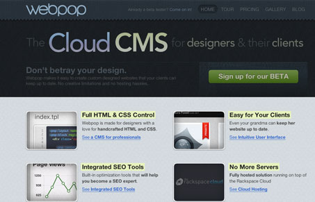
Really nice mood created by the dark textures and colors set on the main headline type. The call to action is super clean and clear. The pricing & plans page is also quite nicely done both visually and from a sales perspective. I also like the “tour” section, it’s not just pop up windows, it’s full pages with a clean clear navigation design.
Glassmorphism: The Transparent Design Trend That Refuses to Fade
Glassmorphism brings transparency, depth, and light back into modern UI. Learn how this “frosted glass” design trend enhances hierarchy, focus, and atmosphere, plus how to implement it in CSS responsibly.


0 Comments