webpop.com

webpopcom

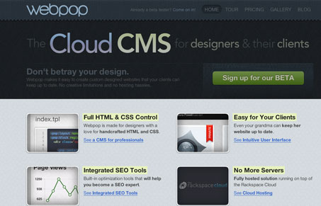
Really nice mood created by the dark textures and colors set on the main headline type. The call to action is super clean and clear. The pricing & plans page is also quite nicely done both visually and from a sales perspective. I also like the “tour” section, it’s not just pop up windows, it’s full pages with a clean clear navigation design.

0 Comments

Submit a Comment

Your email address will not be published. Required fields are marked *

News & Articles

Looking Fast: The Art of Website Speed Perception

Looking Fast: The Art of Website Speed Perception

In the web world, technical speed and user perception matter. By improving design for a faster appearance, you boost conversions and stand out online. Speed isn’t just loading time; it’s perception.

Designing for Errors: Creating User-Friendly Contingency Plans

Designing for Errors: Creating User-Friendly Contingency Plans

Contingency Design hinges on empathy, understanding user frustration, and transforming errors into positive impressions. By embracing these principles, you enhance user experiences, retain customers, and boost revenue in the competitive digital landscap