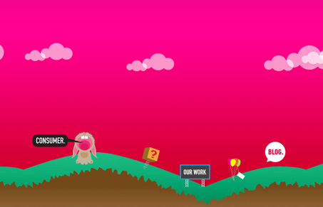
Really different vibe to this site than most. I like the illustrations and how they are using @font-face and how the clouds are animated. It’s cute and quirky too. It’s a little weird when you compare it to standard fare website designs, I don’t mind it in this case though since I think the point is to be fun with it. Carry on consumer, keep doing interesting stuff.
Glassmorphism: The Transparent Design Trend That Refuses to Fade
Glassmorphism brings transparency, depth, and light back into modern UI. Learn how this “frosted glass” design trend enhances hierarchy, focus, and atmosphere, plus how to implement it in CSS responsibly.


The nice thing about it is the true progressive enhancement they’ve done. The site works perfectly without JavaScript. Thumbs up from me for that.
This site is just plain fun. The bunny with his mouth wide open cracked me up. The floating clouds are a nice touch.