visualnotion.com

visualnotioncom

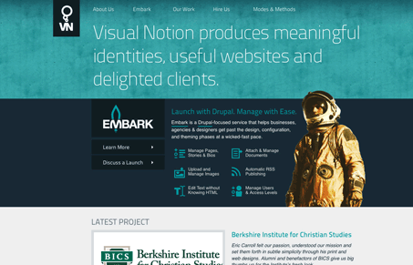
Love these colors, and the icons across the site are nice. The home page is very scannable and easily readable. The content is organized clearly as well. I really like the image of the astronot but I can’t place the context on why it’s there from the content on the page, I get the “embark” and the logo but it might be too vague for your average visitor to get. Overall though, I like the explanation of that section as to what you’re going to get from the service. Good explanative copy will always win for you!

0 Comments

Submit a Comment

Your email address will not be published. Required fields are marked *

News & Articles

Looking Fast: The Art of Website Speed Perception

Looking Fast: The Art of Website Speed Perception

In the web world, technical speed and user perception matter. By improving design for a faster appearance, you boost conversions and stand out online. Speed isn’t just loading time; it’s perception.

Designing for Errors: Creating User-Friendly Contingency Plans

Designing for Errors: Creating User-Friendly Contingency Plans

Contingency Design hinges on empathy, understanding user frustration, and transforming errors into positive impressions. By embracing these principles, you enhance user experiences, retain customers, and boost revenue in the competitive digital landscap