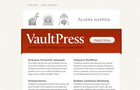
I really like the soft feel to the vaultpress.com website. It’s the colors and textures that really sell it. The icons and copy are funny and that big red ribbon shape just jumps out at you. The blog page is a nice shift in design, it’s not too far of course from the overall feel of the site and it’s a welcome break from that first simple page you get.
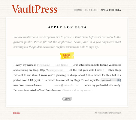
The beta form is also interesting, they are doing the “mad libs” style of form design here and I’d love to see some signup numbers posted to their blog if/when they get them pulled together.


0 Comments