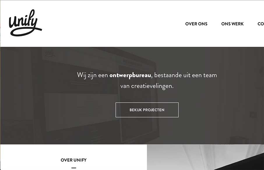
Very simple, clean, minimal site from Unify out of the Netherlands. What I really like is on their portfolio detail pages – they’ve posted they color palette and font’s they used. Would be cool if they named the fonts too – but this way you can see how the parts come together in the rest of the portfolio detail.
Here’s a quick howdy from the designer:
Submitted by: Dave Dragt @unifymedia
Role: Designer & Developer
We are Unify. A small design studio based in the Netherlands. We help our clients build or improve their branding or applications for all platforms and screen sizes.


Yes site look very clear & eyes catching
Thank you Ryan!