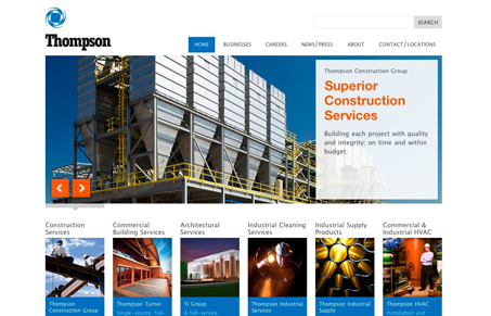
I really like the implied simplicity in this home page design. The stark background and hard edges on all the elements leads you to see this as a very simple layout, however it isn’t, the grid is complex enough to pull your eye down from the large slideshow images past the 6 services area marquees, then down into the more text heavy areas of the page. The footer area is also interesting how it mostly doesn’t read as a footer like we’re all used to looking at, but has relevant content that follows you around the site but blends in with the overall page designs. Nice work here.


I think they’ve done a great job putting together a fairly large site with subsites and making it look simple – like Gene said. I’ve been loving that highlighted text trend and it’s cool to see it used on a different kind of site like this. Good job also on the simple subpage layouts with the nifty slideshows.
On the subpage – When it comes to low contrast areas, I wonder how much it should be taken into consideration that some monitors aren’t going to pick up on it. I couldn’t see that grey/white area at all on the subpage until I moved it to another monitor.
Agreed on the subpage comment Julia. I also knew you’d dig seeing a site that wasn’t a portfolio or personal blog type.