
The digital device landscape is a dynamic one, with a myriad of screen widths, and resolutions to consider. While it’s true that numerous factors influence people finding, using, and enjoying your website’s content (not to mention conversions) is a paramount component. In this article, we’ll delve into the crucial role of context in your website design, UX, and development, and how understanding and optimizing it can help your site not just survive, but thrive in the competitive online sphere.
We Live and Work in Complexity
Designing and building websites and web apps have become more intricate than ever before. Gone are the days when a one-size-fits-all approach sufficed. With a plethora of devices, each boasting its unique screen dimensions and resolutions, it’s a daunting task for web designers and developers to ensure that their creations function flawlessly across the board.
The Challenge of Screen Widths
Screen widths vary from the tiny displays of smartphones to the expansive real estate of desktop monitors. Each width presents a different canvas for us to work with. Therefore, it’s imperative to tailor your website to adapt seamlessly to these diverse screen sizes. This adaptability, often referred to as a “responsive design,” ensures that your content remains accessible and visually appealing, regardless of the device it’s viewed on.
The term “responsive web design” was coined by Ethan Marcotte in his article titled “Responsive Web Design” published on A List Apart in May 2010. He introduced the concept and laid the foundation for this approach to web design. “Responsive design” is a web design approach that involves creating websites and web applications that adapt and adjust their layout and content presentation based on the device’s screen size and orientation. This ensures optimal user experience across various devices, including smartphones, tablets, and desktop computers. Responsive design uses CSS media queries, flexible grids and media to dynamically rearrange and resize elements on a web page to fit the specific screen dimensions, providing a consistent and user-friendly interface.
The Fluidity of Design
Maintaining fluidity between different screen sizes is another critical aspect of modern web design. Users expect a smooth and cohesive experience as they transition from one device to another. This entails not only resizing text and images but also repositioning elements and adjusting layouts to suit the specific screen width. Striking this balance between aesthetics and functionality is an art in itself.
The Challenge of Images and Media
Images and media elements add an extra layer of complexity to web design. These assets need to be optimized for fast loading times while retaining their visual appeal. Compressing images, choosing the right formats, and implementing lazy loading techniques are just some of the strategies employed to ensure that media doesn’t hinder your website’s performance.
The Core Concept: Context
Amidst all these technical considerations, there’s a fundamental concept that often gets overshadowed but is, in fact, the heart of successful web design, UX, and development: context. It’s essential to adopt a “content-first” or “mobile-first” approach, with context as your guiding light.
Understanding Context
Context, in this context (pun intended), refers to the purpose and usage of your website. It’s about understanding why your website exists and how people will interact with it to achieve its intended goals. Whether you’re designing a personal blog, an e-commerce platform, or a corporate website, the context should be at the forefront of your decision-making process.

The “Hamburger” Navigation Context Dilemma
A small but telling example of the significance of context in web design is the ubiquitous “hamburger” navigation icon. Originally borrowed from a different context, this three-line symbol, when used in isolation, can be perplexing for users. Its meaning may vary from one website to another, causing confusion. To overcome this, it’s essential to consider how this icon fits within the overall context of your website’s navigation and functionality.
It’s quite trendy to simply use a “Hamburger” menu icon regardless of desktop or mobile screen width.
Does it really and truly work? Let’s dig into this a little:
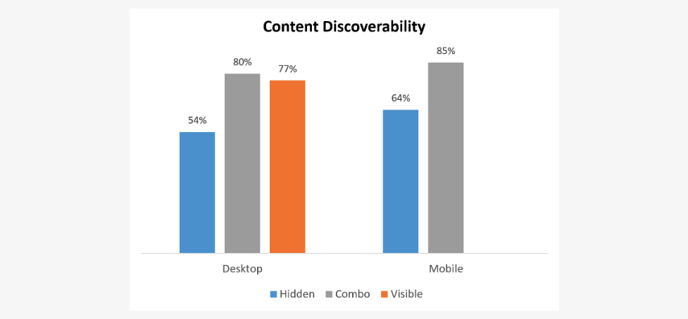
The Neilson Norman group found that on both mobile and desktop, the content discoverability was significantly lower when the navigation was hidden: This measure showed a more than 20% drop in discoverability on sites with hidden navigation, compared with sites with visible or combo navigation. In other words, visible or combo navigation made people more likely to complete the task successfully and without relying on search.
On the one hand, the hamburger menu is an effective way to store a navigation drawer in an uncluttered way, but on the other hand it also requires an extra click from the user, which is considered a fatal wrongdoing to a lot of webpage designers.
Via Mailchimp Blog
There is a lot to consider with just the Hamburger navigation alone, such as touch zones on mobile screen widths:
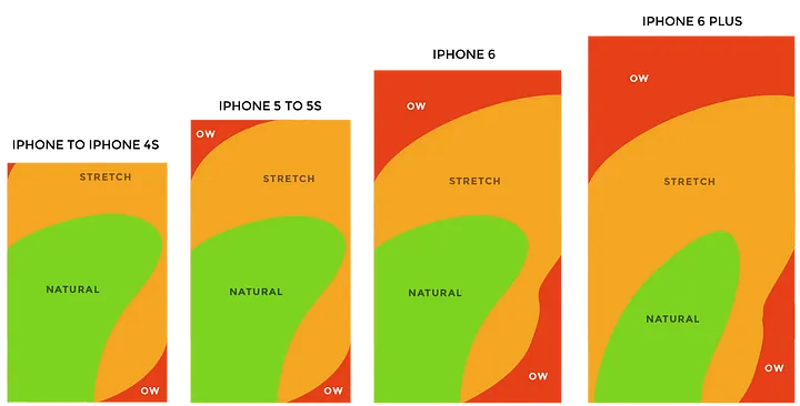
Via UX Planet – Try this: grab your phone and unlock it as you normally would, then try and reach the top left corner with your thumb, without re-adjusting your grip.
Wrap-up
In the intricate web of modern website design, UX, and development, context is the thread that ties it all together. It’s the understanding of why your website exists, who your audience is, and how they will interact with your content. While there are numerous factors that influence it’s performance, providing a seamless and contextually rich user experience is undoubtedly one of the most potent. So, as you embark on your next web project, remember that while the digital landscape may be complex, focusing on context first will always be a simple yet powerful strategy.
Further Reading:
https://uxdesign.cc/the-state-of-hamburger-menu-a0a0c0a93aec
https://www.invisionapp.com/inside-design/pros-and-cons-of-hamburger-menus/
https://www.nngroup.com/articles/hamburger-menus/
https://uxplanet.org/the-ultimate-guide-to-the-hamburger-menu-and-its-alternatives-e2da8dc7f1db


0 Comments