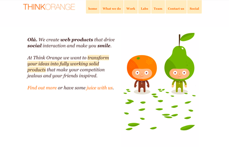
Great use of white space to help support the illustration work. Which is superbly simple and fantastic. This is a great use of the scrolling page effect, since the white space really drives it to you. Check out what Gio and I have to say in the screen review, we go into a bit more detail on the things we both liked about it.
Microinteractions
Microinteractions are subtle site animations enhancing engagement. They include triggers, rules, feedback, and sometimes loops/modes. Practical uses: improving engagement, guiding user behavior. Well-designed microinteractions boost user engagement and your online presence.


olá!
Thanks for the nice review. We took the time to fix some bugs that we only noticed after seeing your video. Great input. 🙂
Hmm… fun way of doing a review. Like it!
“.pt” is for Portugal, guys! 🙂
Hah! I did look it up after we did the screencast. Thanks for the encouragement too, stay tuned for more! 🙂
@Pedro – You’re very welcome, good sites are easy to review.
If you’re feeling curious about Portugal, why not visit us at the SHiFT Conference? lot’s of fun guaranteed. 🙂
http://2010.shift.pt