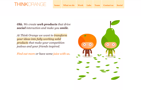
Great use of white space to help support the illustration work. Which is superbly simple and fantastic. This is a great use of the scrolling page effect, since the white space really drives it to you. Check out what Gio and I have to say in the screen review, we go into a bit more detail on the things we both liked about it.
Looking Fast: The Art of Website Speed Perception
In the web world, technical speed and user perception matter. By improving design for a faster appearance, you boost conversions and stand out online. Speed isn’t just loading time; it’s perception.


olá!
Thanks for the nice review. We took the time to fix some bugs that we only noticed after seeing your video. Great input. 🙂
Hmm… fun way of doing a review. Like it!
“.pt” is for Portugal, guys! 🙂
Hah! I did look it up after we did the screencast. Thanks for the encouragement too, stay tuned for more! 🙂
@Pedro – You’re very welcome, good sites are easy to review.
If you’re feeling curious about Portugal, why not visit us at the SHiFT Conference? lot’s of fun guaranteed. 🙂
http://2010.shift.pt