
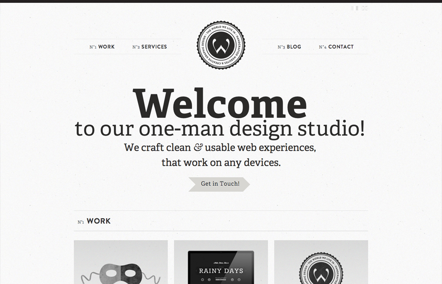
Another solid minimal(ish) design that’s great. I love the bold typography and black and white coloring. Keeps it all very clean feeling. Then those charts of skill-sets are very craftily done.


Fitts’s Law: Why the Easy Button Wins
Large, close targets are faster to hit than small, distant ones, that’s Fitts’s Law. A look at the 1954 rule behind buttons, prime and magic pixels, thumb zones, and dark patterns.


We? One-man?
Good eye Justin. It’s important to keep your copy in the same “person” or “tense” isn’t it?
First of all, thank you very much for selecting my portfolio.
Concerning Justin comment, I know this is a bit schizophrenic to use “we” instead of “I”. However, I turned the question in every directions and I have come to use the “we.” In France, when you’re a freelancer, it means that you’re a specialist (front-end dev, designer , for example) so I preferred to say “studio” because I do a lot of things. My customers thought we were a lot… so I / we changed for “one-man”! Arrrghhh … where are my pills? ; )
PS. If you have any suggestions, please let me know.
You’re not the only one to struggle with that Oliver. I think about it a lot too.
I/we feel less alone…