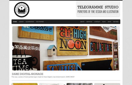
Really nice looking and cool design. I love the “basic” approach to this site, the design really lets the work show itself off well while really looking good at the same time. Technically there’s not a lot going on with the site, but you don’t always need whizz-bangery to make something stand out, you just need great work to show off.


This design is great. The type and surrounding elements are a shades of gray which really lend nicely to drawing the eye to the photography. The JavaScript slider was a nice touch as well.
I would have liked to see some alpha transparency on hover/ non hover states on the bottom images to give them some more “pop” and enhance the UX.
Typography was lovely.
I love this web site! Great typography.