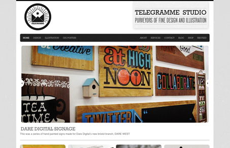
Really nice looking and cool design. I love the “basic” approach to this site, the design really lets the work show itself off well while really looking good at the same time. Technically there’s not a lot going on with the site, but you don’t always need whizz-bangery to make something stand out, you just need great work to show off.
Glassmorphism: The Transparent Design Trend That Refuses to Fade
Glassmorphism brings transparency, depth, and light back into modern UI. Learn how this “frosted glass” design trend enhances hierarchy, focus, and atmosphere, plus how to implement it in CSS responsibly.


This design is great. The type and surrounding elements are a shades of gray which really lend nicely to drawing the eye to the photography. The JavaScript slider was a nice touch as well.
I would have liked to see some alpha transparency on hover/ non hover states on the bottom images to give them some more “pop” and enhance the UX.
Typography was lovely.
I love this web site! Great typography.