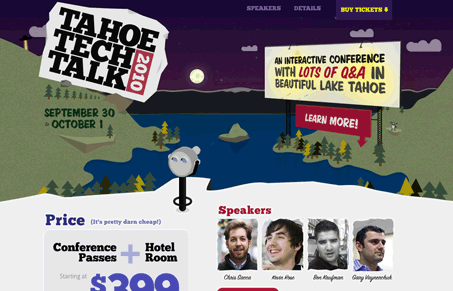
Neat HTML5 site here. First off all, Julia and reviewed this in our screen cast and the skyline was dark (nightime) and I as I write this post it’s set to daytime, that’s a really nice touch. Also Droid Sans… We both loved the vibe of the site, the illustrations are great and they help to set the tone of a nice relaxed, open conversation like event. We were a little bit confused as to the actual audience of the event, given it’s called a “tech” talk conference and all the speakers seem to be start up owners or investor types. Generally though, I think it’s aimed at the web app creation industry. Overall nice looking, well put together website.
Glassmorphism: The Transparent Design Trend That Refuses to Fade
Glassmorphism brings transparency, depth, and light back into modern UI. Learn how this “frosted glass” design trend enhances hierarchy, focus, and atmosphere, plus how to implement it in CSS responsibly.


Beautiful site from @shaunchapman & @akopec – It actually starts as day time and changes to night when you scroll back up. Very well done.
Also, RADOOL = Rad + Cool – http://twitter.com/garyvee/statuses/466472472
Thanks for the corrections, Caleb.
That’s a cool effect with the day to night change on scroll guys. Thanks for pointing that out.
Radoool!
Thank you so much for the review guys. Much appreciated 🙂
You got it Adam! I just wish I could go!