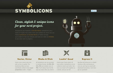
Aside from being some really great looking icons, this simple layout sells them very effectively. The clean smooth boxy shapes of the icons are reflected well in the design elements of the page but with a nice illustrative touch using the robot in the top section of the site. Good work on both the icons and this page!


0 Comments