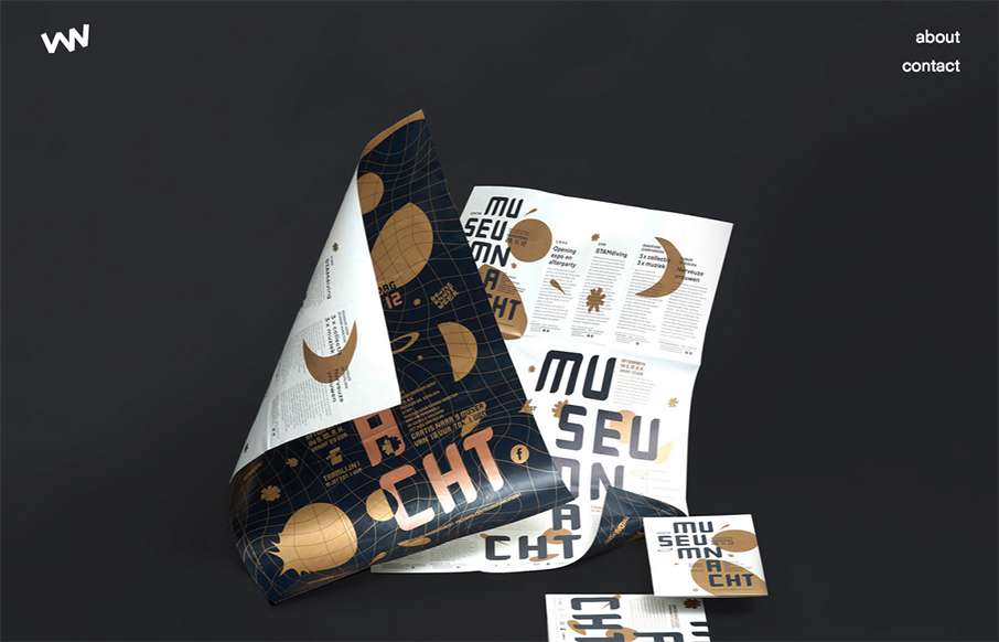
Really simple layout, it’s like one project at a time to check out then only 2 other simple nav items. I love this approach. I don’t like the bottom “read more” link, I’d like it to be more obvious across all images used for this section. That said, the simplicity lends itself to overcoming any obstacles that this could create for a user.
Glassmorphism: The Transparent Design Trend That Refuses to Fade
Glassmorphism brings transparency, depth, and light back into modern UI. Learn how this “frosted glass” design trend enhances hierarchy, focus, and atmosphere, plus how to implement it in CSS responsibly.


0 Comments