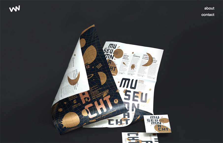
Really simple layout, it’s like one project at a time to check out then only 2 other simple nav items. I love this approach. I don’t like the bottom “read more” link, I’d like it to be more obvious across all images used for this section. That said, the simplicity lends itself to overcoming any obstacles that this could create for a user.
Looking Fast: The Art of Website Speed Perception
In the web world, technical speed and user perception matter. By improving design for a faster appearance, you boost conversions and stand out online. Speed isn’t just loading time; it’s perception.


0 Comments