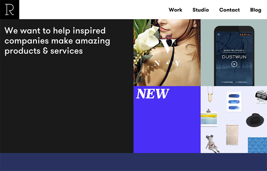
Pretty slick looking layout for Studio Rodrigo. I really like the big open areas matched up with smaller product images in a small grid like it has. Pretty solid design as you scroll down the home page too. Love this site.


The Call to Action, Revisited
The Call to Action hasn’t changed in a decade, but the bar has. A fresh look at prominence, copy, mobile tap targets, and accessibility, with lessons from three major design systems.


0 Comments