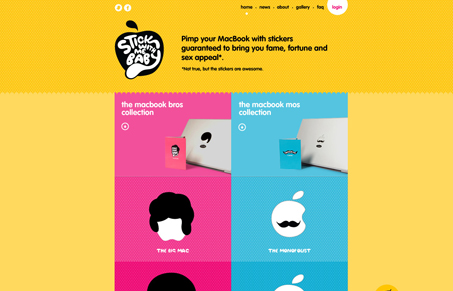
Very cool design take on the shopping cart. They’ve managed to make it fun and enjoyable as well as functional – it’s what we all want to do, right? I’m loving the way I can drag and drop the mustache icon into the cart fly-out at the bottom. The login form also comes flying open when you click on it.
The smartest part here is that the overall visual parts of this site’s design have been kept really simple, it’s largely two columns of products that you can buy. It could have very easily been designed to look overwhelming and really making the user get lost in the products instead of enjoy the interactions. Good stuff here.


0 Comments