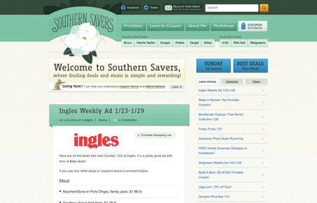
Wonderful design for the Southern Savers website. From the branding to the layout this site is gorgeous. I see now why Jason Beaird uses it as his case study example in his book.
The branding is memorable and the little chipmunk is fun and helps set a laid back tone. The colors really lend themselves well to echoing that welcoming and easy going feeling. This site is extremely detailed, even though it appears quite simple and clean when you first start digging into it. I love that each navigation and interactive element has 3 states, that’s just thoroughness and craft.
The website is powered by wordpress and has largely a blog like deliver of the content, meaning it’s all linear and since it’s couponing that’s perfect since they are linear in time as well. That never gets in the way of the delivery of content since it’s so well organized and linked up, a testament to the architecture work put into the website for sure.


0 Comments