
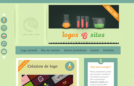
Lovely illustrations make up this website and are largely what keeps it interesting. The fixed sidebar navigation is also neat, I don’t think the icons really mean much in terms of matching up with their content but they are fun looking and there is a main horizontal navigation that does all the same things. The portfolio section is interesting in that it’s treated completely different from the main site.




0 Comments