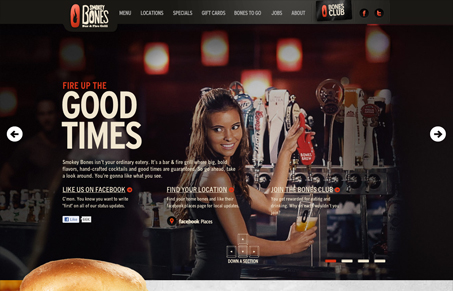
Pretty cool vertical parallax implementation for Smokey Bones. They gots some good ribs, i’ll say that much too. I really love the little static photo animation they have going on with that first image – they really gotta figure out a way to do that for each of the main images because it’s a really nice touch.
Overall the scrolling and slight animation effects with the parallax work really well, they help tell a story about your visit to the restaurant as you make your way down. Plus hot chicks with beer and food… well you get the point of the marketing without my 2 cents…


this site hasbeen already rated.. .whats up?
Where has it been rated Diego?
Do you know if the site was designed by Push in Orlando? They do great work.
Not sure Sebastian, it was an anonymous submission.
I wear I have seen this site before!
I swear*
Yeah, Push in Orlando did this site http://www.pushhere.com/projects/smokeybones-com-refresh/