
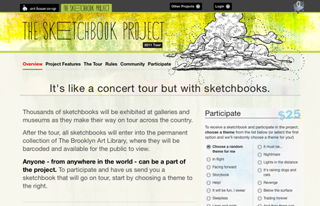
Pretty cool concept and nice site too. It’s pretty much a typical blog layout but the header is very nicely done. I love that illustration and display type used. There is some nice hierarchy in font sizes in the copy too, it’s subtle but well chosen. Overall rather nice looking I think.




I agree, they have laid things out well and the colour scheme is good too.