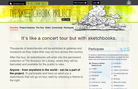
Pretty cool concept and nice site too. It’s pretty much a typical blog layout but the header is very nicely done. I love that illustration and display type used. There is some nice hierarchy in font sizes in the copy too, it’s subtle but well chosen. Overall rather nice looking I think.
Glassmorphism: The Transparent Design Trend That Refuses to Fade
Glassmorphism brings transparency, depth, and light back into modern UI. Learn how this “frosted glass” design trend enhances hierarchy, focus, and atmosphere, plus how to implement it in CSS responsibly.


I agree, they have laid things out well and the colour scheme is good too.