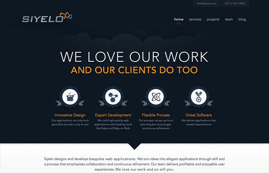
I like the contrast between the dark background in the top half and the white in the bottom half. It’s a nice responsive layout too, check out how those main 4 icon/sections change when targeting different screen widths yo. I also really dig how there is consistency yet each page feels a little different at the same time. Good work!
Looking Fast: The Art of Website Speed Perception
In the web world, technical speed and user perception matter. By improving design for a faster appearance, you boost conversions and stand out online. Speed isn’t just loading time; it’s perception.


0 Comments